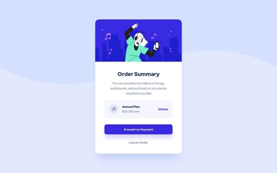
Design comparison
Solution retrospective
I am proud to be making steady progress in my knowledge of HTML and CSS. I'm not thinking of anything different to do right now. The more experience I gain, the changes will come to improve the project.
What challenges did you encounter, and how did you overcome them?One challenge was ensuring the grid on subscription container correctly. I'm making steady progress in my knowledge about Grid and overcoming it, so I think it looks great.
I also overcomed the background SVG pattern. At first, I didn’t think about using width: 100%;, so the image didn’t stretch with the width of the screen. background-size: contain; was also important. So the resolution was:
What specific areas of your project would you like help with?body { background: url(../images/pattern-background-mobile.svg); background-size: contain; background-repeat: no-repeat; background-position: top; width: 100%; }
Anything. Thank you so much for your time and effort in evaluating this.
Community feedback
Please log in to post a comment
Log in with GitHubJoin our Discord community
Join thousands of Frontend Mentor community members taking the challenges, sharing resources, helping each other, and chatting about all things front-end!
Join our Discord
