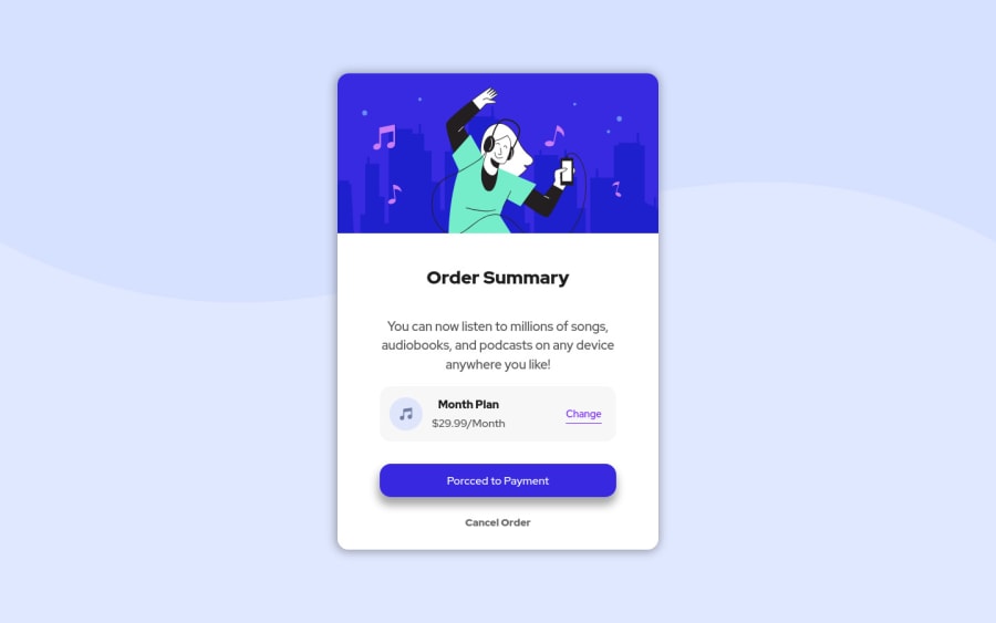
Design comparison
Solution retrospective
It is done. This is my second challenge, and this time I felt less nervous. I must say that although the challenge did not require JavaScript I added a few lines of code to make the payment plan section change every time you click on the change button, that's the reason why it starts from the monthly plan and not yearly.
Any feedback is welcome!
Community feedback
- @cacostedPosted over 2 years ago
Hello Ricardo, your solutions looks great and the added feature with JavaScript is great.
One thing that I noticed is that you used a
borderon the "change" link, this is not big deal but if you pay attention de text does a little jump when you hover in and out.There are different ways to approach this, but in this case I think the intended version was to simulate a default
<a>style with the underline, you can do this withtext-decoration: underline. Also another way to fix the jumping would be usingoutlineinstead ofborder.0 - @correlucasPosted over 2 years ago
👾Hello Ricardo, congratulations for your new solution!
Your solution seems great, something you can improve is the shadow, thats too evident and was the first thing I saw. The box-shadow is too much dark and strong, the secret to create best and smooth shadow you need to give it less
opacityand moreblurhere’s a good value for this shadowbox-shadow: 5px 6px 12px 5px rgb(0 0 0 / 5%);This is a good site to create good shadows and just drop the code into the css https://www.cssmatic.com/box-shadow
👋 I hope this helps you and happy coding!
0
Please log in to post a comment
Log in with GitHubJoin our Discord community
Join thousands of Frontend Mentor community members taking the challenges, sharing resources, helping each other, and chatting about all things front-end!
Join our Discord
