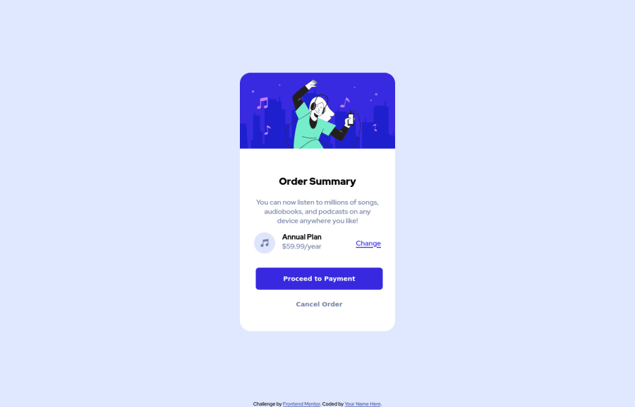
Design comparison
SolutionDesign
Community feedback
- @VCaramesPosted almost 2 years ago
Hey there! 👋 Here are some suggestions to help improve your code:
- The “illustration” and "music icon" in this component are purely decorative. ⚠️ Their
alt tagshould be left blank and have anaria-hidden=“true”to hide them from assistive technology.
More Info:📚
- There is no need ⚠️ for this since it’s already
16pxby default;
html { font-size: 16px; }- To properly center ✅ your content to your page, you will want to add the following to the
body(this method uses CSS Grid):
body {
    min-height: 100vh;
    display: grid;
    place-content: center;
}
More Info:📚
[Centering in CSS][https://moderncss.dev/complete-guide-to-centering-in-css/]
- The web development process can be made easier and expedite the process 🚀 by implementing a
CSS Reset. Here are some examples that you can freely use: Josh Comeau Reset, Eric Meyer Reset
If you have any questions or need further clarification, feel free to reach out to me.
Happy Coding! 🎆🎊🪅
Marked as helpful0 - The “illustration” and "music icon" in this component are purely decorative. ⚠️ Their
Please log in to post a comment
Log in with GitHubJoin our Discord community
Join thousands of Frontend Mentor community members taking the challenges, sharing resources, helping each other, and chatting about all things front-end!
Join our Discord
