Design comparison
SolutionDesign
Solution retrospective
My second Project:
-
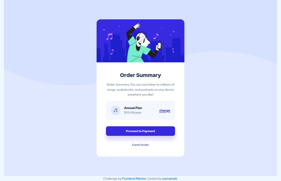
I was recommended to use axe DevTools to tackle the accessibility issues and so i did. The accessibility issus that i have in this project have to do with the colors i used. What can i do about it since i used the colors form the project style guide?
-
I tried to improve the BEM, since i didn't use it properly in the last project. Knowing if i got it right would be helpful.
Community feedback
Please log in to post a comment
Log in with GitHubJoin our Discord community
Join thousands of Frontend Mentor community members taking the challenges, sharing resources, helping each other, and chatting about all things front-end!
Join our Discord
