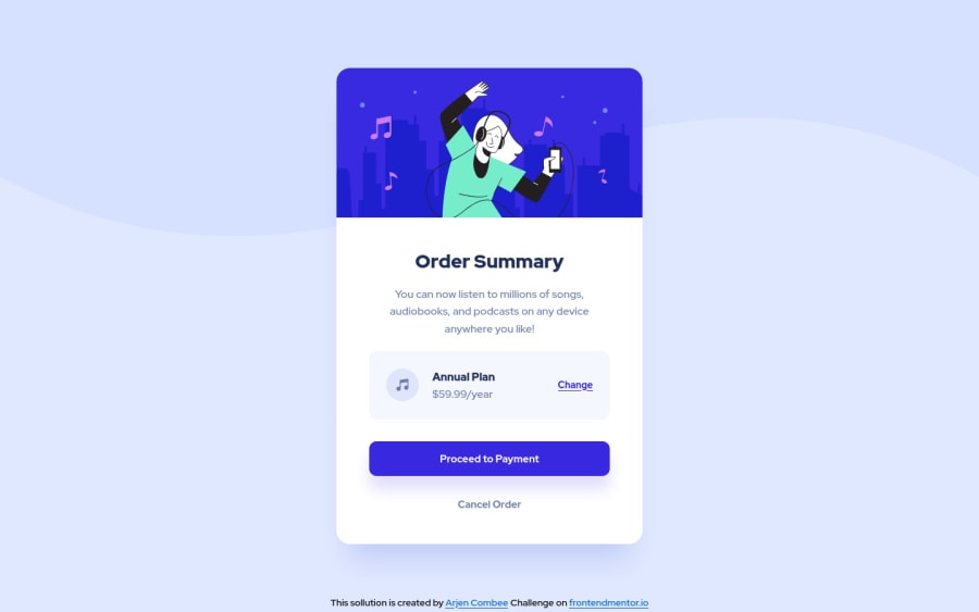
Order Summary Component - CSS Flexbox and custom properties
Design comparison
Solution retrospective
A nice second challenge to get better in coding HTML and CSS. Not sure about the background images though... Any suggestions?
Please feel free to give me your feedback, I'm here to learn and having fun while doing so. 😀
Community feedback
- @grace-snowPosted about 3 years ago
Hi again
Firstly, this looks great!
Same comments as before really with minor code improvements, plus I’d add
- header is a landmark so should really be outside of the main element
- again with the meaningful elements on annual pricing and price
- are you sure the anchor tag and button choices are right on this? I would expect change to trigger a toggle action (button element) and proceed/cancel to trigger navigation (anchor elements)
- focus-visible (or focus) is the most important pseudo state style to add to interactive elements. Essential for keyboard users (like me) so include it every time
Good job on this
Marked as helpful0 - @BrendonMedeirosPosted about 3 years ago
Nice work man! It's responsive to different screen sizes. One thing is that you applied effects to :hover and not to :active links. I don't know if it was proposital or not, but maybe you've missed that detail in the challenge sample.
Marked as helpful0 - @ArCombeePosted about 3 years ago
Thanks for all the feedback and tips, did a first refactor of this project and think it is better. Later this year I will look at the code again, maybe version 3 will emerge 👍🤔
0
Please log in to post a comment
Log in with GitHubJoin our Discord community
Join thousands of Frontend Mentor community members taking the challenges, sharing resources, helping each other, and chatting about all things front-end!
Join our Discord
