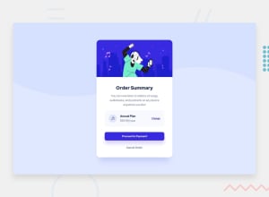
Design comparison
Solution retrospective
I wasn't able to maintain the background's proportion/sizing for the mobile view. All and any pointers would be lovely.
Community feedback
- @grace-snowPosted about 3 years ago
Hello
Take another look at the html. A few small but important foundational issues to change on this
- order summary should be a h1
- annual plan should be a h2
- if an image is decorative, alt should be left blank like
alt=“” - change would probably toggle the price so should be a button (as opposed to anchor tag which is for navigation)
- use landmark elements - main for main-container, footer for that attribution (this will fix accessibility warnings in your report)
CSS looks good! Only thing I can see is missing is focus visible styles on interactive elements. That is essential, much more important than :link, :visited and :active styles (I rarely even include those)
Good luck
Marked as helpful0@ShawwnscottPosted about 3 years ago@grace-snow thank you so much for taking the time out to check it out! I will make the necessary adjustments. I appreciate the feedback!
0@vanzasetiaPosted about 3 years ago@grace-snow Why "annual plan" can be a heading? In my opinion
strongtag would be a better solution, since heading tag is usually used for titling eachsectionorarticle.0@grace-snowPosted about 3 years ago@vanzasetia headings are to give structure to the document, strong is only to add emphasis in a paragraph. This should be a heading for the content underneath it - the price
0
Please log in to post a comment
Log in with GitHubJoin our Discord community
Join thousands of Frontend Mentor community members taking the challenges, sharing resources, helping each other, and chatting about all things front-end!
Join our Discord
