Design comparison
Community feedback
- @nenamartinezPosted about 3 years ago
Hi there! I'm more experienced as a designer than coder so I'll be focusing on that in my feedback.
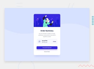
-Spacing issues. There should be more space under the paragraph and more space between the "proceed to payment" button and 'cancel order' part. Also, the spacing inside the "annual plan" box is not right. The music icon should be more left, 'annual plan' info as well, and the 'change' should be more to the right.
-Overall sizing. Because the vertical spacing above isn't enough, the card looks too wide compared to the design.
-Color issues. The heading text should be dark blue, not black. The 'annual plan' text should be bold and dark blue, also.
-No hover state. The design is supposed to have hover states on the 'Proceed to payment' button and the other links. I don't see any hover state change on the site preview. 'Cancel order' doesn't seem to be a link.
Also, I cannot view your code with the link above. The link seems to be broken. If you want to get more feedback on the code specifics, please try to fix the link so your code will be visible to everyone. Keep on coding! I'm new to it all, too.
Marked as helpful1
Please log in to post a comment
Log in with GitHubJoin our Discord community
Join thousands of Frontend Mentor community members taking the challenges, sharing resources, helping each other, and chatting about all things front-end!
Join our Discord
