Design comparison
Solution retrospective
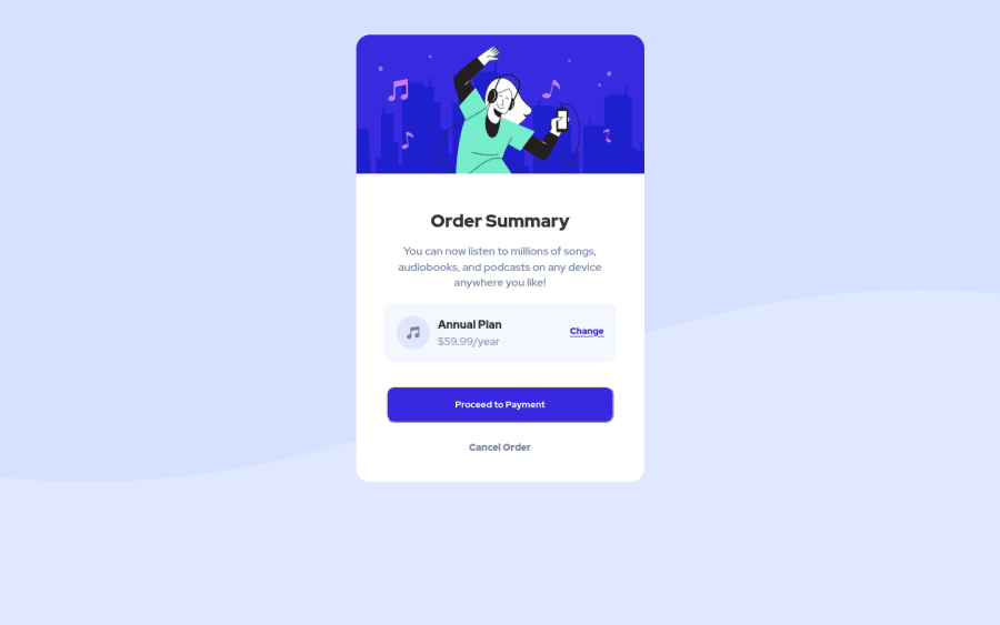
The Order - Summary Challenge Completed. This Design Completed Based on Css FlexBox & Html5. & this wedbpage is completed desktop version and mobile version. #html5 #Css3
#WebDevelopment #100DaysOfCode
Community feedback
- @darryncodesPosted almost 3 years ago
Hi Dev Rathore,
Great solution, really well done!
-
i'd really like to encourage you to design mobile first. This article changed my perspective on it. You'll be surprised how much less code you'll write and it'll enhance performance
-
it's worth considering clearing up your accessibility report. Change
<div class="container">
to<main class="container">
. Here is some useful information about semantic html -
i'd consider centering your design nicely in the viewport with FlexBox. I've also tweaked the back ground size and position properties to closer match the design:
/* margin-top: 50px; */ background: url(images/pattern-background-desktop.svg) hsl(225, 100%, 94%); background-size: 100% auto; /* background-position: center; */ background-repeat: no-repeat; display: flex; justify-content: center; align-items: center; min-height: 100vh;
0@GitHub-dev12345Posted almost 3 years ago@darryncodes Thanks so much you read my code and support me 🥳👍
And i use your suggestion code bro . Can you follow me my gitub account
0 -
Please log in to post a comment
Log in with GitHubJoin our Discord community
Join thousands of Frontend Mentor community members taking the challenges, sharing resources, helping each other, and chatting about all things front-end!
Join our Discord