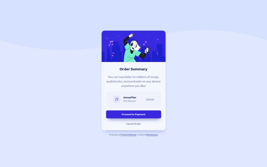
Design comparison
Solution retrospective
Hi Frontend Mentor peers:
- Is there a better way to write the hover effect than how I wrote it in my code?
.button:is(:hover,:focus){
    background-color:hsl(245, 75%, 52%, 80%);
    cursor: pointer;
}

.hover:is(:hover,:focus){
    cursor:pointer;
    color:hsl(228, 45%, 44%);
    font-weight: var(--fw-bold);
}

.hover-1:is(:hover,:focus){
    cursor:pointer;
    color: black;
    font-weight: var(--fw-bold);
}
- How can I anchor the footer note to the bottom of the page? I tried using `.bottom{position: fixed; bottom: 5px;' and it would cause the footer note to overlap onto the summary card. 🤷♀️
Thank you.
Community feedback
- @MilleusPosted over 1 year ago
👋 Hello!
I think using
:isis fine, but I would probably move thecursor: pointerto the base element (non-hover) instead.More importantly though, it would be a lot better if the proper interactive HTML elements, i.e. <button> or <a>, were used instead of <div>, <u> and <b>. Using the proper elements would help with accessibility greatly - able to navigate on with keyboard, pressing "Space" or "Enter" triggers the element, screen reader would announce that it is a clickable button or link, etc.
As for how to anchor the footer note, my approach was to use CSS grid. I'd declare 3 rows (1fr, auto, 1fr) and have the <main> in row 2 and <footer> in row 3. Row 1 is an empty row to help keep <main> centered perfectly (thus why it is 1fr, similar to row 3).
I hope this helps and happy coding!
Marked as helpful1@mochimoooPosted over 1 year ago@Milleus Can I ask what do you mean by moving "cursor: pointer to the base element (non-hover)"?
And thank you for giving the advice on CSS grid! I haven't really touch on that subject yet but it sounds helpful to learn it.
0@MilleusPosted over 1 year ago@mochimooo Ah, I would usually put
cursor: pointeras part of the base styling of a button so when there are no hover or focus, a button would still havecursor: pointerwhen moused over.I think a tiny advantage of this is writing less code when there are more button variants because I wouldn't have to keep setting
cursor: pointerto each button variant's hover and focus.something like this:
.button {
  // base styling of a button
  ...
  cursor: pointer; // I'd add it here
}

.button[data-variant="primary"] {
  background-color: red;
}

.button[data-variant="primary"]:hover,
.button[data-variant="primary"]:focus {
  background-color: pink;
}

.button[data-variant="secondary"] {
  background-color: blue;
}
...
Oh, as for CSS grid, check out this video by Kevin Powell where he covers various grid concepts. Reaaaallly good video that helped me understand CSS grid a lot deeper.
There are also some CSS grid game websites like CSS grid garden to test your grid skills :)
0
Please log in to post a comment
Log in with GitHubJoin our Discord community
Join thousands of Frontend Mentor community members taking the challenges, sharing resources, helping each other, and chatting about all things front-end!
Join our Discord
