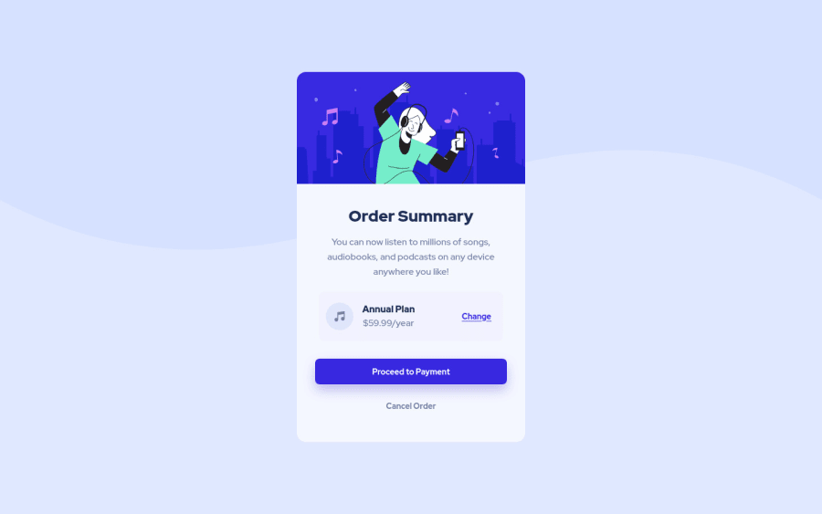
Design comparison
Solution retrospective
Hi, just now I completed one more challenge. Let me know if any of the community members has any feedback regarding best practices.
Community feedback
- @denieldenPosted about 3 years ago
Hi Tejaswini, great work on this challenge! 😉
Also remove all
marginfrom.containerclass because with flex they are superfluous and usemin-height: 100vhinsteadheightto bodyOverall you did well! Hope this help 😁
Marked as helpful1 - @FluffyKasPosted about 3 years ago
Heyo,
Your solution looks great on all screens! The only thing I'd recommend is looking into writing more helpful alt texts. They're a substitute for people unable to see the actual images so they should be descriptive. If you can't come up with an appropriate description, it probably means that the image doesn't really add anything to the content and just there for decoration in which case it's better to leave the alt text empty - which, if you ask me, could be said of both images in this challenge. If you really would like to stick to having an alt text, you could add something like "Girl dancing and listening to music" to the top illustration ^^
Marked as helpful1
Please log in to post a comment
Log in with GitHubJoin our Discord community
Join thousands of Frontend Mentor community members taking the challenges, sharing resources, helping each other, and chatting about all things front-end!
Join our Discord
