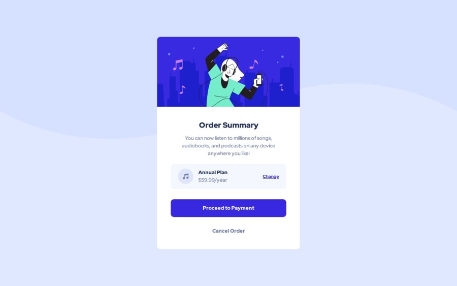
Design comparison
SolutionDesign
Solution retrospective
Hey Guys, This is my 4th Frontend mentor challenge.
Looking forward to any feedback. Thank you.
Community feedback
- P@atif-devPosted over 1 year ago
Hi, congrats🎉 on completing the challenge. Better take care about following points.
- When we open GitHub repository link, at right side you will find an About Section. There, also include a live preview link of your project. It is better for someone to check your preview project while interacting with code.
- Include a README file in your GitHub project's solution and write about your working flow, findings, new learned things, useful resources, etc.
- Have seen your project in my browser(1366 * 768), container looks big. I think if you will add margin top and margin bottom on container and will make the container little bit smalller(height wise) then view will look NICE. You can also check responsiveneess for different screen sizes using LT browser(Download: LT browser)
(Have any questions🧪?reply to this comment😇)
--Got any questions, REPLY--
Hope you will find this Feedback Helpful.
Let's connect for learning📝 and sharing🤝. Twitter , LinkedIn , GitHub
Marked as helpful1
Please log in to post a comment
Log in with GitHubJoin our Discord community
Join thousands of Frontend Mentor community members taking the challenges, sharing resources, helping each other, and chatting about all things front-end!
Join our Discord
