Design comparison
Solution retrospective
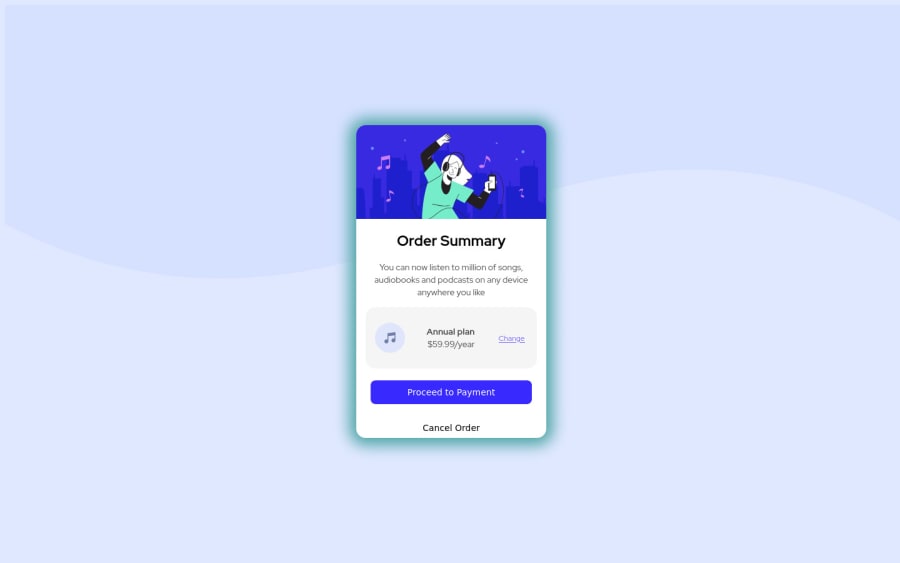
Hello mentors. This is my Day 5 of leaning html and CSS and I really enjoyed doing this challenge with some custom features inside. Hope the community will like it ! I guess i didn't put the right font family or it was just my browser . Please suggest any improvements
PS : I loved the hover effects and transitions :D
Community feedback
- @hrk-berserker27Posted over 2 years ago
Hi there, you did a great job in completing this challenge. Following are some suggestions that you can incorporate into your solution to improve its accessibility and sort out the HTML issues:
- Enclose the content inside the main tag because a web page should have at least one landmark.
- Add the alt attribute to your image tags so that it will remove the accessibility warnings you are getting in your report. For further read, check this article: "https://accessibility.psu.edu/images/imageshtml/";
- Don't use paragraph tag inside button or span tag as it has semantic value. Replace it with span elements or any inline elements such <em> or <i> tags and alter their display to block elements in CSS if needed. Styling tip:
- The box shadow on the card is not in sync with the background. Try changing it or removing it. (It will improve the look remarkably)
- Try using a lighter color for button text for better contrast from its background and adding a little more padding to the buttons.
- Try increasing the card's height or little padding to the bottom of the card (with the box-sizing property set to border-box) because the cancel button seems to be overflowing. *Don't forget to mark it as helpful if these suggestions helped to improve your work.
Marked as helpful0 - @mohammedlahboubPosted over 2 years ago
HI @ByteOverload congratulation on your solution and keep learning you are doing great , i have a tip for you if you want to center an element inside the body use display
flex
on the body.body{ width: 100vw; to make body width equal to screen width height: 100vh; to make body height equal to screen height display: flex; set display mode for body as flex align-items: center; to center items inside the body vertically justify-content: center; to center items inside the body horizontally }
to use the SVG pattern you can make a background-image for the body
body{ background-color: hsl(225, 100%, 94%); **remove it from <main> background-image: url(./images/pattern-background-desktop.svg); background-repeat: no-repeat; background-position: center top; background-size: contain; } @media (max-width: 600px) body { background-image: url(./images/pattern-background-mobile.svg); }
remove all of the position properties from the div element and it should be center after you apply the above listed rules:
position: absolute; top: 50%; left: 50%; margin-top: -250px; margin-left: -150px;}
And if you like to customize solutions check my profile for inspiration https://www.frontendmentor.io/profile/mohammedlahboub
0
Please log in to post a comment
Log in with GitHubJoin our Discord community
Join thousands of Frontend Mentor community members taking the challenges, sharing resources, helping each other, and chatting about all things front-end!
Join our Discord