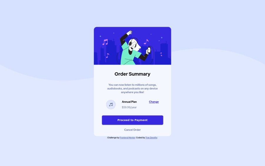
Design comparison
SolutionDesign
Solution retrospective
My 4th project here.
I've became much better at structure setup, so there were really no lengthy periods of confusion while doing this. Plus I turned swiftly to StackOverflow everytime I needed smart clarifications.
However i couldnt quite perfect mobile view using media queries (scroll lines still appear). Will aim to rectify that in next project. But i'd appreciate any tips towards resolving this challenge?
Community feedback
Please log in to post a comment
Log in with GitHubJoin our Discord community
Join thousands of Frontend Mentor community members taking the challenges, sharing resources, helping each other, and chatting about all things front-end!
Join our Discord
