

Design comparison
SolutionDesign

Solution retrospective
What I have learned / practised in this project:
- box shadow
- the solution is sometimes not that hard (I've first set the background-picture with pseudo-elements, but it was just a simply background image...)
What was difficult?
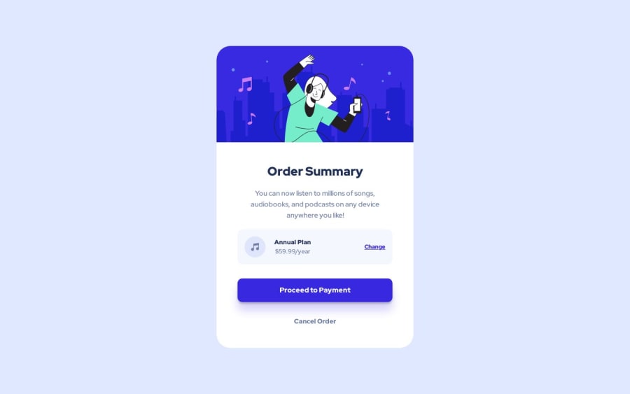
- I find it sometimes difficult to know what html element that i could use, for example: The price and type of the plan (annual plan/$59.99 ) I was in doubt about using a p or an ul.
Community feedback
Please log in to post a comment
Log in with GitHub
Join our Discord community
Join thousands of Frontend Mentor community members taking the challenges, sharing resources, helping each other, and chatting about all things front-end!
Join our Discord