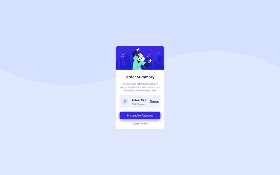
Design comparison
Community feedback
- @YacoubDweikPosted 10 days ago
Salam Mohammad mashAllah Well done bro!
I really liked your Portfolio as well, looks awesome!
Here, I just want to say that never ever put an img alone like this bro, always wrap it inside a parent div that's exclusive for it only.
You might ask me why right? I wanna show you, right click on your design then inspect, try to resize the design to its maximum, you will see that the whole design will shrink and grow while you resizing except that img first cuz u gave it width and not max-width, second if u gave it max-width it will tend to stay fixed under 250px or so, why? cuz simple the original size of the img is not smaller than 250px to shrink to that size.
By wrapping it with a parent div the img and give the img only max-width: 100% then it will shrink and grow according to its parent.
Also I'd recommend you looking at BEM for CSS Classes, Good luck Bro!
Marked as helpful1
Please log in to post a comment
Log in with GitHubJoin our Discord community
Join thousands of Frontend Mentor community members taking the challenges, sharing resources, helping each other, and chatting about all things front-end!
Join our Discord
