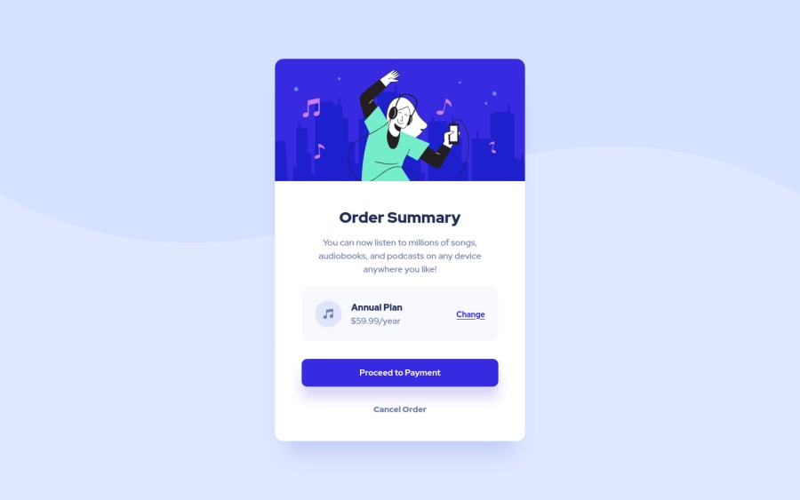
Design comparison
Solution retrospective
Hi! 🫵🏻
This is my solution to Order Summary Component challenge.
It was a lot of fun working on that challenge. I could put my current knowledge to work. My implementation will be updated in future when I find better solutions.
Thank you for your time and feedback, it really helps me to grow!
Community feedback
- @0xabdulkhaliqPosted over 1 year ago
Hello there 👋. Congratulations on successfully completing the challenge! 🎉
- I have other recommendations regarding your code that I believe will be of great interest to you.
COMPONENT MEASUREMENTS 📐:
- Use
min-height: 100vhforbodyinstead ofheight: 100vh. Setting theheight: 100vhmay result in the component being cut off on smaller screens.
- For example; if we set
height: 100vhthen thebodywill have100vhheight no matter what. Even if the content spans more than100vh.
- But if we set
min-height: 100vhthen thebodywill start at100vh, if the content pushes thebodybeyond100vhit will continue growing. However if you have content that takes less than100vhit will still take100vhin space.
.
I hope you find this helpful 😄 Above all, the solution you submitted is great !
Happy coding!
Marked as helpful2@diru0Posted over 1 year ago@0xAbdulKhalid Thank you Abdul. I changed body height to min-height as you suggested. 👋🏻
1 - @legion40216Posted over 1 year ago
maybe you can improve on ur semantic html of main tag instead of div, But kudos bro the HTML and CSS is very clean and organized refrain from using height property.
Marked as helpful1@diru0Posted over 1 year ago@legion40216 Thanks Suleman, I changed .card tag to main as you suggested. 🦾
1
Please log in to post a comment
Log in with GitHubJoin our Discord community
Join thousands of Frontend Mentor community members taking the challenges, sharing resources, helping each other, and chatting about all things front-end!
Join our Discord
