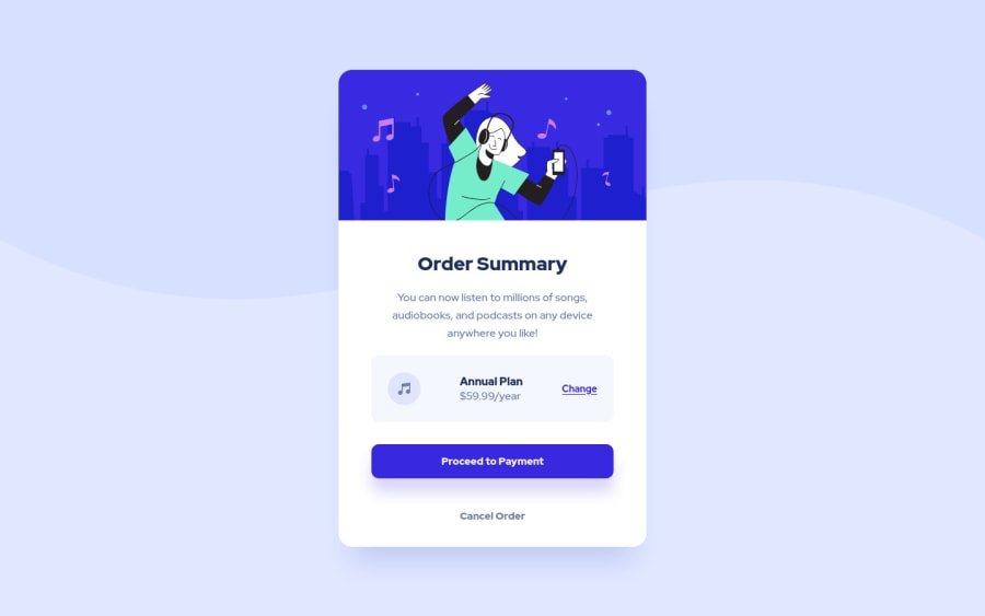
Design comparison
SolutionDesign
Community feedback
- @correlucasPosted over 2 years ago
👾Hello Treasure, congratulations for your new solution!
Your solution design is perfect, but there are some fixes to do in order to enable the responsivity.
1.Replace all properties with
widthinside the card and use insteadmax-width. Note that if you use width this means that the card will not grow or contract, usingmax-widthinstead allows the container to contract and have the maximum size to grow..card { max-width: 327px; /* height: 567px; */ background-color: white; border-radius: 20px; display: flex; flex-direction: column; align-items: center; box-shadow: 0px 40px 40px -20px rgb(13 48 189 / 15%); }2.To have the image resizing with the container use
max-width: 100%anddisplay: block👋 I hope this helps you and happy coding!
Marked as helpful0
Please log in to post a comment
Log in with GitHubJoin our Discord community
Join thousands of Frontend Mentor community members taking the challenges, sharing resources, helping each other, and chatting about all things front-end!
Join our Discord
