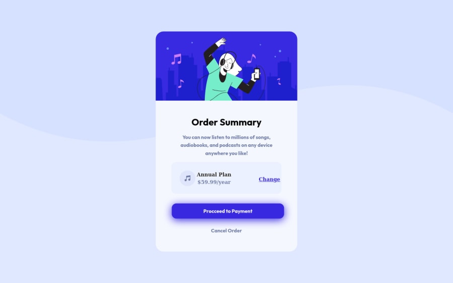
Design comparison
Solution retrospective
I'm still having a problem with display flex but because of that, I've started to learn more about using the flex. I do mistakes here, and I can see them. I'll probably to change them in my next solutions. Feel free to point out my mistakes, I'll gladly to know it!!
Community feedback
- @ASH2001princePosted about 2 years ago
Hello jom congratulations for your new project -I have some HTML tips for you:
- you can use the <section> or <article> elements to gather the elements like the <h1>,<p> and <img> together.
- instead of coping the <svg> you can import the image by using <img> element.
- <footer> usages for the last informations like names some links maybe and we can put the <address> attribute inside it as well.
Marked as helpful1@JmlsoteyzaPosted about 2 years ago@ASH2001prince Thankyou bro, but do you have any idea why my "Annual plan" and the other texts changed for some reason? like it gets big compare to my site.
0@ASH2001princePosted about 2 years ago@Jmlsoteyza yes I think I do if you would put the music icon and the "Annual Plan" and "change" link in one div or section without the others and remove all the extra heights it well be smaller and for a last thing you can align the items using the flex system. hope you find it helpful
Marked as helpful0
Please log in to post a comment
Log in with GitHubJoin our Discord community
Join thousands of Frontend Mentor community members taking the challenges, sharing resources, helping each other, and chatting about all things front-end!
Join our Discord
