Design comparison
SolutionDesign
Community feedback
- @DanielfwwPosted 9 months ago
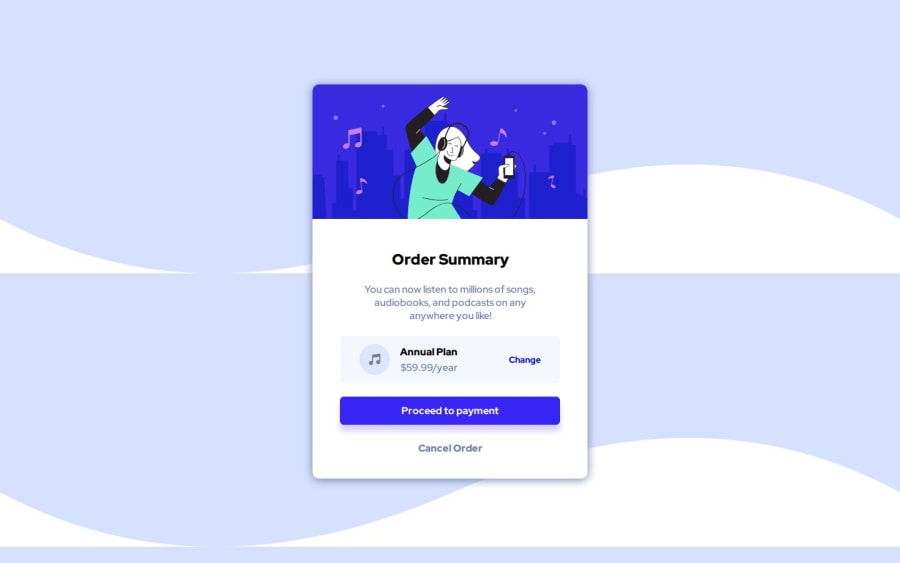
Hey Shihab, your project looks amazing. If I had to recommend anything here is to change your background. If you put this stuff into body:
background-repeat:no-repeat; background-color:hsl(225, 100%, 94%);
You should not have the double background anymore.
0@Shihab328Posted 9 months agoMr.Danielfww thanks for your recommendation. I will keep this in mind in future.
1
Please log in to post a comment
Log in with GitHubJoin our Discord community
Join thousands of Frontend Mentor community members taking the challenges, sharing resources, helping each other, and chatting about all things front-end!
Join our Discord
