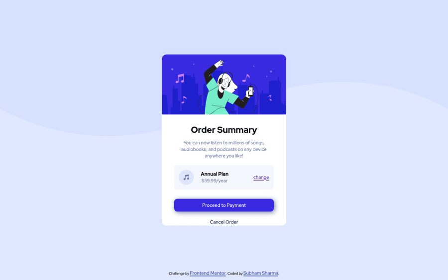
Design comparison
Solution retrospective
This was my second project on frontmentor.io. It was great working on this project, II learnt a lot. If you find any suggestions for me, it's highly appreciated.
Community feedback
- @MojtabaMosaviPosted almost 3 years ago
1- Writing accessible html is all about placing content in tag the meaningfully describe them and whenever there's a html tag for job you should always give it priority over implementing it by yourself mainly because you can not implement a holistic functionality for that tag.
For instance the "proceed to payment" on this component is decribed perfectly be a link which is suppose to take the user to when claims to take him. Using a link tag comes with benefits of accessibility features like screen reader reads the link like "link to ...." but you can not implement this feature by youself.
2- Never leave a href empty becuase it does't make sense to link to nowhere and you can always create a dead link by setting the value of href to "#".
3- You should only provide the alt attribute if the it can provide additional information which is helpful to assitive technologies such as screen readers and leave it empty if the image is purely decorative, I think the letter is the case here because someone listening to this with screen reader would get the same information withtout it.
keep coding :=)
Marked as helpful0 - @subhamenginePosted almost 3 years ago
Thank you so much for this valuable feedback.
0
Please log in to post a comment
Log in with GitHubJoin our Discord community
Join thousands of Frontend Mentor community members taking the challenges, sharing resources, helping each other, and chatting about all things front-end!
Join our Discord