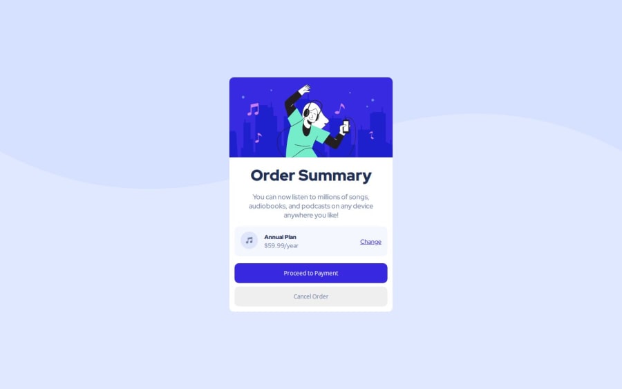
Design comparison
Solution retrospective
I'm really proud of how I used the <main> tag to enhance the semantic structure of the page and avoid potential semantic errors. Ensuring the content is accessible and correctly structured feels like a step in the right direction toward writing professional-quality HTML. I also feel good about how clean and organized the code turned out—using CSS variables for colors and typography made the styling process much more manageable and scalable.
Next time, I would focus on adding a mobile-first design approach to ensure the layout looks great on smaller screens without relying too heavily on media queries.
What challenges did you encounter, and how did you overcome them?I initially struggled with structuring the page semantically, especially figuring out the appropriate tags to use. For instance, deciding to use the <main> tag for the central content was a learning moment. It took some research to understand its significance in making the content more accessible and logical.
I took the time to read about semantic tags and their best practices, which helped me make better decisions about how to structure my HTML.
What specific areas of your project would you like help with?While I’ve made the layout responsive, I’d like feedback on how I can improve the design for smaller screens. Are there any best practices I missed or additional tweaks I can make to improve usability on mobile devices?
Community feedback
Please log in to post a comment
Log in with GitHubJoin our Discord community
Join thousands of Frontend Mentor community members taking the challenges, sharing resources, helping each other, and chatting about all things front-end!
Join our Discord
