

Design comparison

Solution retrospective
Nothing
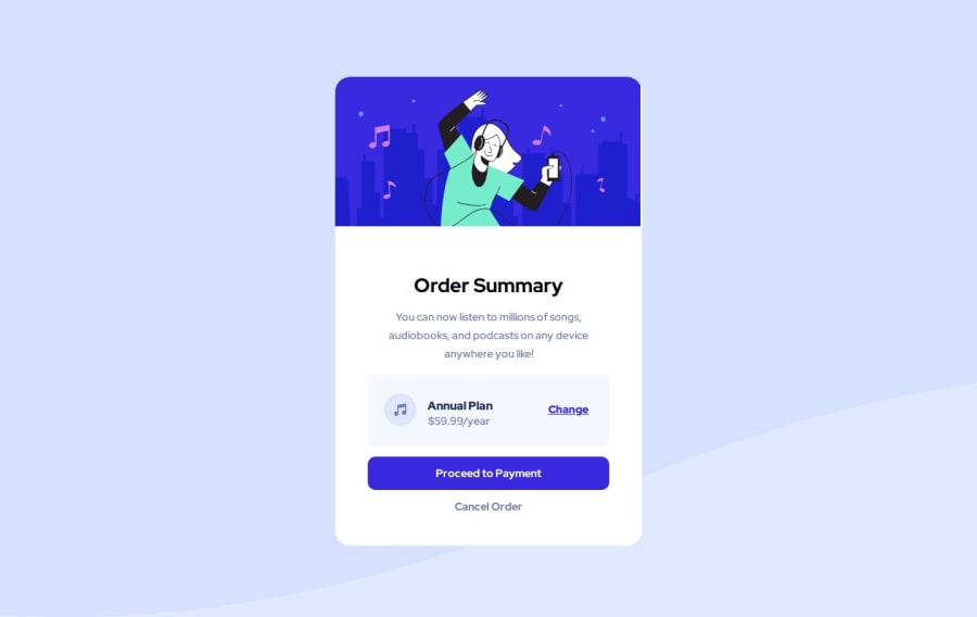
What challenges did you encounter, and how did you overcome them?The annual something how do i achieve like the annual at the top and the bottom is price and the icon and change is from the each side.
What specific areas of your project would you like help with?The annual something how do i achieve like the annual at the top and the bottom is price and the icon and change is from the each side.
If you have any suggestions on how I can improve this project, feel free to leave me a comment!
Community feedback
- @undrthegraveyardPosted 11 months ago
Hey,
Good job on the code.
To get the desired design for the .card__plan component, you need to implement a nested flexbox concept. Include the "<img src="/images/icon-music.svg" alt="" />" and "<div class="card__plan-content">" under <div class="card__plan-img">. Then implement flexbox in the "card__plan-img" class, with a flex-direction of row, and also with a suitable gap: between them. PS: Your class "card__plan-content" should also be in flex, with a flex-direction: column and with a gap between both the text.
Try this, and let me know.
Happy Coding 😁
1@ErrorCode710Posted 10 months ago@undrthegraveyard what do you mean sir? like this
<body>
  <div class="card__plan">
    <div class="card__plan-img">
      <img src="/images/icon-music.svg" alt="Music Icon">
      <div class="card__plan-content">
        <div class="card__plan-heading">Annual Plan</div>
        <div class="card__plan-price">$59.99/year</div>
      </div>
    </div>
    <div class="card__plan-cta">
      <a href="#">Change</a>
    </div>
  </div>
</body>```

My css:

```.card__plan {
  display: flex;
  flex-direction: column;
  gap: 20px;
  padding: 20px;
  background-color: #f8f9fa;
  border: 1px solid #dee2e6;
  border-radius: 8px;
}

.card__plan-img {
  display: flex;
  flex-direction: row;
  gap: 10px;
  align-items: center;
}

.card__plan-content {
  display: flex;
  flex-direction: column;
  gap: 5px;
}

.card__plan-heading {
  font-weight: bold;
  font-size: 1.2em;
}

.card__plan-price {
  color: #6c757d;
}

.card__plan-cta {
  text-align: right;
  margin-top: auto;
}

.card__plan-cta a {
  color: hsl(228, 45%, 44%);
  text-decoration: none;
} ```
0 - @undrthegraveyardPosted 10 months ago
Here is what I meant. You could change the name of the classes and/or variables according to your case.
HTML Syntax:
<body>
  <div class="card__component">
        <div class="card__component-details">
        <img src="images/icon-music.svg" alt="Music icon">
         <div class="plans">
          <h2>Annual Plan</h2>
          <p>$59.99/year</p>
         </div>
        </div>
        <a href="#" class="card__link-button">Change</a>
      </div>
</body>
Custom CSS:
    display: flex;
    flex-direction: row;
    justify-content: center;
    align-items: center;
    gap: 2em;
    background-color: var(--clr-neutral-100);
    padding: 1rem 0.5rem;
    border-radius: 1em;
    margin: 0.5em 1.5em;
}
.card__component-details{
    display: flex;
    flex-direction: row;
    justify-content: center;
    align-items: center;
    gap: 1em;
}
.plans h2{
    font-size: var(--fs-base);
    font-weight: var(--fw-bold);
    color: var(--clr-neutral-400);
}
.plans p{
    font-size: var(--fs-base);
    font-weight: var(--fw-base);
    color: var(--clr-neutral-200);
}
.card__component-details img{
    color: var(--clr-neutral-200);
}
.card__link-button{
    color: var(--clr-primary-400);
    font-size: var(--fs-base);
    font-weight: var(--fw-bold);
    text-decoration: underline;
}
.card__link-button:hover,
.card__link-button:focus {
    color: hsl(245, 56%, 62%);
} ```
0

Please log in to post a comment
Log in with GitHub
Join our Discord community
Join thousands of Frontend Mentor community members taking the challenges, sharing resources, helping each other, and chatting about all things front-end!
Join our Discord