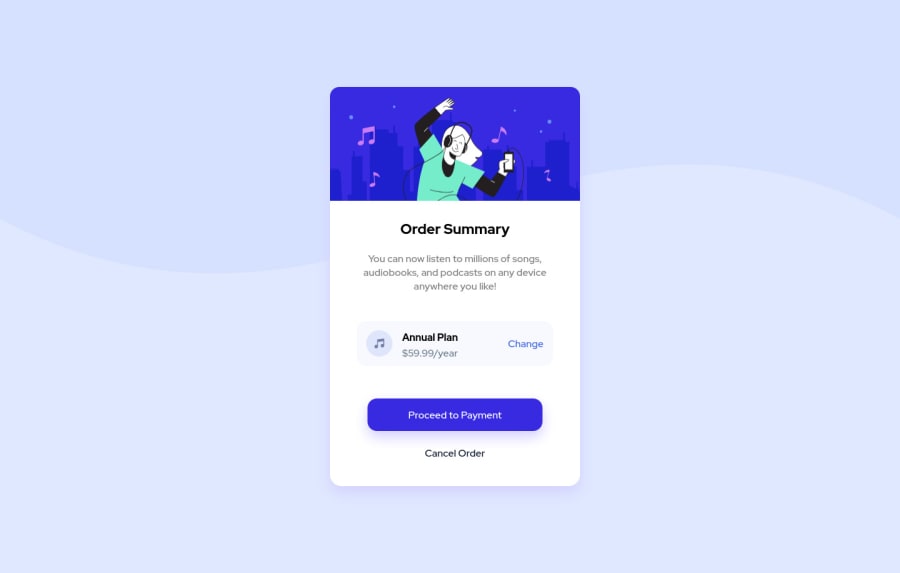
Design comparison
Solution retrospective
Hello, My first project on Frontend Mentor. It was fun.
I spent a lot of time position stuff and center thing with CSS grid and Flexbox. If you find anything weird in my solution or have any tips or trick regarding my solution please say it!
Thanks, I will be working on the next challenge!
Community feedback
- @ohsitePosted almost 3 years ago
Hi, It turned out great!
If you want any feedback I will tell you what I do. Not sure why, this is kind of my workflow, so:
1st use html5 semantic tags, such as: header, main, nav, footer, aside, use one h1 tag per page. It helps structure the document better. So in your case switch h2 with h1 and style it to look smaller.
2nd I don't give body a width, just height 100vh,
3rd I don't use ID to style things. It has to do with the specifity and presidency.
4th I don't use pixel unit. Unless it refers to value that has no need to change. Like when I do really really tiny transform on button hover so like "move it up 2px" or give border radius 3px.
I really love the idea of using grid. Im aware of it but it's something I have to practice some more. And I basically never use it to structure single dimensional items/cards.
Keep up good work! All the best!
Marked as helpful1@icest99Posted almost 3 years ago@ohsite
All of the point you mentioned is going to be so useful for my next project as I was never aware of these before haha.
Thanks for the feedback! :]
0
Please log in to post a comment
Log in with GitHubJoin our Discord community
Join thousands of Frontend Mentor community members taking the challenges, sharing resources, helping each other, and chatting about all things front-end!
Join our Discord