


Design comparison


Solution retrospective
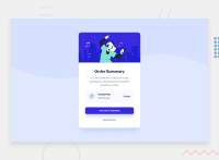
I am struggling with understanding how I can have this better fit my mobile device. I use an iPhone SE and it appears very Zoomed it. Any feedback on how I can get this to look good on mobile and not just desktop would be appreciated.
Community feedback
Please log in to post a comment
Log in with GitHub
Join our Discord community
Join thousands of Frontend Mentor community members taking the challenges, sharing resources, helping each other, and chatting about all things front-end!
Join our Discord