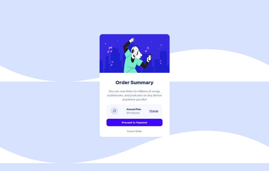
Design comparison
Solution retrospective
I really enjoyed doing this project! I tried to make it as close to the desired design as I could. Any advise about my code is welcome!
Community feedback
- @kenreibmanPosted over 2 years ago
Hi @DaliaMuj ! I'm happy that you enjoyed the project, you did a great job!
I have a few things that stand out to me which I hope would benefit you:
-
The first thing I notice is your background. Most times when you set a background with an image, your image will repeat indefinitely. Sometimes it's great. However in this challenge, to match the original design, you only need one background image.
-
In order to prevent that, in your css, give the
bodywhere thebackground-imageis being set, another line called:background-repeat: no-repeat. -
Then give it another line
background-color:and set the color to the slightly lighter blue that the ReadMe file gave you, and you've got a very similar looking background to the original! -
There are some weird horizontal scrolling in your project which I also fixed by change your
height: 100vhtomin-height: 100vh -
I would also give your
bodyamargin: 0andpadding: 0to reset any default margins and padding that html puts onto your elements. -
Usually you want your site's content to be wrapped in a
mainelement. I would change yourdivwith the class ofcontainerto amainelement with the class ofcontainerto make it semantically correct.<main class="container"></main> -
The two buttons - "Proceed to Payment" and "Cancel Order" are currently
inputtags which are strictly used for form fields, like when you want a user to input their email/password. In this case, you wouldn't want that here. Instead I would use anatag (anchor tag) and style them. You did it correctly for the "Change" button. Anchor tags are also more "style-able" if you give it adisplay: blockas well. -
Also remember to style your :hover and :focus states for those two buttons to visually show that it is interactable.
I hope this helps, great job! Keep it up!
0 -
Please log in to post a comment
Log in with GitHubJoin our Discord community
Join thousands of Frontend Mentor community members taking the challenges, sharing resources, helping each other, and chatting about all things front-end!
Join our Discord
