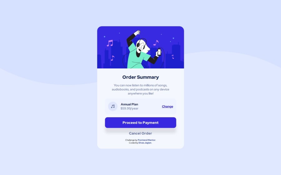
Design comparison
Solution retrospective
I am getting more and more speedy in making these newbie projects.
What challenges did you encounter, and how did you overcome them?Nothing new.
What specific areas of your project would you like help with?Open for your suggestions.
Community feedback
- P@danielmrz-devPosted 12 months ago
Hello, @DivasJaglan!
Your project is looking fantastic!
I'd like to suggest a way to make it even better:
- Using
marginand/orpaddingisn't always the most effective method for centering an element.
Here's a highly efficient approach to position an element at the center of the page both vertically and horizontally:
📌 Apply this CSS to the body (avoid using
positionormarginsin order to work correctly):body { min-height: 100vh; display: flex; justify-content: center; align-items: center; }I hope you find this helpful!
Keep up the excellent work!
Marked as helpful0 - Using
Please log in to post a comment
Log in with GitHubJoin our Discord community
Join thousands of Frontend Mentor community members taking the challenges, sharing resources, helping each other, and chatting about all things front-end!
Join our Discord
