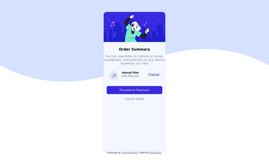


Design comparison

Community feedback
- @Sdann26Posted over 2 years ago
Hi Parimal!
I don't recommend you to set your card heigh to vh because it will get bigger or smaller depending on the screen, in this case it's better to use a fixed size like px, or em and rem would be fine too.
Also remove the margin, this is because we will center the whole card based on the body by adding the following attributes:
body{
min-height: 100vh;
display: flex;
flex-direction: column;
justify-content: center;
align-items: center;
gap: 1em;
}
With min-height we tell it to take the full height size of the device where it is seen as a minimum and it looks pretty good. I'm using flex because I don't want the main and footer to be too far apart because with grid it's a bit complicated to get them well centered.
And to make the background responsive you can also add to the body:
background-color: var(--Pale-blue);
background-size: contain;
I would recommend you to remove the ::before because it is not helping at all.
Dark-blue: hsl(223, 47%, 23%).There are other details to polish like the font-weight to add thickness to the text but let me know if you make the respective modifications to make it look better. All that I mention you I have added in the browser while corregio I hope it helps you.
Good Coding!
0

Please log in to post a comment
Log in with GitHub
Join our Discord community
Join thousands of Frontend Mentor community members taking the challenges, sharing resources, helping each other, and chatting about all things front-end!
Join our Discord