Design comparison
SolutionDesign
Community feedback
- @eewa-SANJPosted almost 2 years ago
Amazing work! Here is my suggestion to make some improvements
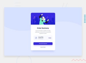
- Main heading color is different than the original design, try to fix it
- As you can see, there is an alignment issue in " Annual Plan $59.99/year" part
- When hovering over the "Proceed to payment", there is the border is still displayed in another color. Try to fix it by applying the same border for the hover effect or remove completely from the border from the button if don't mind.
I think this will help to improve some issues Happy coding😊
Marked as helpful0@JoseEliasMoralesPosted almost 2 years ago@eewa-SANJ Hi Sanjeewa! Thank you so much for the tips! I have applied two, but as for the color of the header, in the design they give me all the colors and the most similar is hsl(223, 47%,23%). Do you think the color is black? Yo pienso que si, pero entonces nose para que se usaria ese color que dan en la guia de estilos. Pense que tal vez mis ojos estaban fallando 😅.
0
Please log in to post a comment
Log in with GitHubJoin our Discord community
Join thousands of Frontend Mentor community members taking the challenges, sharing resources, helping each other, and chatting about all things front-end!
Join our Discord
