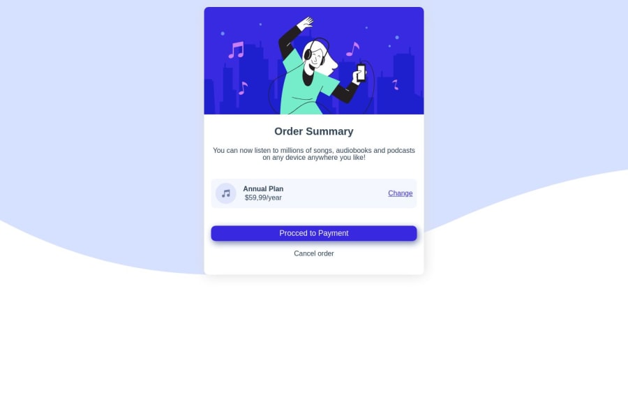
Design comparison
Solution retrospective
Foi bom e desafiador este exercícios, embora parecendo facil para os mais experientes. Continuarei evoluindo
Community feedback
- @eremitaitoPosted about 1 year ago
Olá! Para facilitar algumas coisas, dentro do seu .css, no estilo.css, em vez de você criar um outro file para o reset, dentro do próprio estilo.css você faz isso
* { margin: 0; padding: 0; box-sizing: border-box; }
o * aplicará no código inteiro o reset!
para centralizar o card inteiro no centro da tela, coloque o "main", dentro de uma div (pode ser qualquer nome, eu vou usar "container")
<body> <main class="content"> <!-- --> <section class="content__s1 "> <img src="images/illustration-hero.svg"> </section> <!-- --> <section class="content__s2 seccao"> <h1>Order Summary</h1> <p> You can now listen to millions of songs, audiobooks and podcasts on any device anywhere you like! </p> </section> <!-- --> <section class="content__s3 seccao"> <article> <img src="images/icon-music.svg"> <div> <h2>Annual Plan</h2> <p>$59,99/year</p> </div> </article> <a href="#">Change</a> </section> <!-- --> <section class="content__s4 seccao"> <button type="submit" >Procced to Payment</button> <a href="#">Cancel order</a> </section> </main> </body>
ficando desse jeito
<body> <div class="container"> <main class="content"> <!-- --> <section class="content__s1 "> <img src="images/illustration-hero.svg"> </section> <!-- --> <section class="content__s2 seccao"> <h1>Order Summary</h1> <p> You can now listen to millions of songs, audiobooks and podcasts on any device anywhere you like! </p> </section> <!-- --> <section class="content__s3 seccao"> <article> <img src="images/icon-music.svg"> <div> <h2>Annual Plan</h2> <p>$59,99/year</p> </div> </article> <a href="#">Change</a> </section> <!-- --> <section class="content__s4 seccao"> <button type="submit" >Procced to Payment</button> <a href="#">Cancel order</a> </section> </main> </div> </body>
assim, o css compreenderá que o "main" é um só, então no seu file "estilo.css", faça isso
.container { max-width: 350px; margin: 0 auto; height: 100%; display: flex; align-items: center; justify-content: center; }
o responsável por centralizar, será o flex, align-items e justify-content.
espero que isso te ajude, se não funcionar, pode entrar em contato comigo que eu vou tentar te ajudar, qualquer coisa eu refaço o código parte por parte
Marked as helpful0@NgunzaFranciscoPosted about 1 year ago@eremitaito Obrigado. Vou levar em conta daqui pra frente
0
Please log in to post a comment
Log in with GitHubJoin our Discord community
Join thousands of Frontend Mentor community members taking the challenges, sharing resources, helping each other, and chatting about all things front-end!
Join our Discord