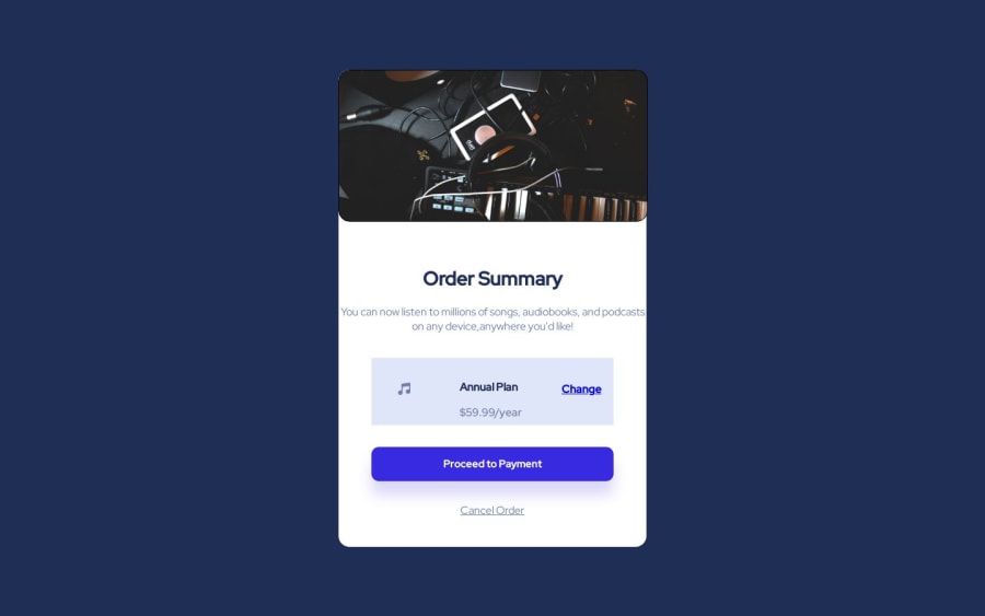
Not Found
Not Found
Not Found
Not Found
Not Found
Not Found
Not Found
Not Found
Not Found
Not Found
Not Found
Not Found
Not Found
Not Found
Not Found
Not Found
Not Found
Not Found
Not Found
Not Found

Submitted

Order Summary Component

Aaryn 130

@Aaryn-Robinson

Desktop design screenshot for the Order summary component coding challenge

This is a solution for...

  • HTML
  • CSS
1newbie
View challenge

Design comparison


SolutionDesign

Solution retrospective


The most difficult part of the project was implementing the right margins to replicate the frontendmentor.io layout. I spent a majority of my time incorporating margins.

One area of my code I'm unsure on is the required padding and trying to implement the paths from Figma successfully without breaking my design. I am designing on Chromebook so there is some limitations.

How have you guys implemented the solutions? and I am open to feedback from everyone so feel free to chime in on how i could've done better. Thank you!

Community feedback

@arifaisal123

Posted

Good work. However, I have couple of opinions for you.

  • Instead of using just border-radius: 1rem for your image container, you can use border-top-left-radius and border-top-right-radius to make the bottom borders flat and close to the design layout.
  • You can use media-queries to make it mobile responsive. Currently, it is aligned to the right in the mobile version.

Marked as helpful

1

Please log in to post a comment

Log in with GitHub
Discord logo

Join our Discord community

Join thousands of Frontend Mentor community members taking the challenges, sharing resources, helping each other, and chatting about all things front-end!

Join our Discord