Design comparison
SolutionDesign
Solution retrospective
Any feedback and best practices advice would be appreciated!
Community feedback
- @shashreesamuelPosted over 2 years ago
Hey good job completing this challenge
Keep up the good work
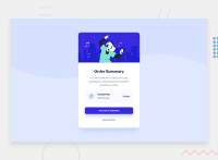
Your solution looks great however I think that the card needs to be scaled up a little bit using
transform: scale()Secondly the button within the card needs a subtle box-shadowI hope this helps
Cheers Happy coding 👍
0
Please log in to post a comment
Log in with GitHubJoin our Discord community
Join thousands of Frontend Mentor community members taking the challenges, sharing resources, helping each other, and chatting about all things front-end!
Join our Discord

