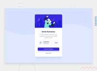
Design comparison
Solution retrospective
Hello Hello FM community!
This is my solution for the Order Summary Component challenge.
If anyone has any advice, I would be most grateful as it will help me in my next challenges and grow as a developer.
I'm still having trouble to create layouts that are really responsive.
Sure, the layout works just fine at 1440 px and 375 px width, but the scaling of some objects gets messy with other widths, mostly because the sizes are hardcoded (and not in %s), but if I try to use %s layouts, well... the results are quite bad :D.
If anyone has some handy articles, courses or classes that tackles this, it would be very helpful!
Thanks!
Community feedback
- @danielmrz-devPosted 10 months ago
Fala @LucasW92!
Seu projeto ficou ótimo!
Tenho uma sugestão:
- Faz o padrão de background aplicando as configurações ao
<body>ao invés do<main>. O background não faz parte do conteúdo principal, é meramente um enfeite na tela.
Isso ajuda a despoluir um pouco as configurações do
<main>e a ficar mais claro o que é background e o que é o conteúdo (no código, pois visualmente dá pra saber).Espero que ajude!
0 - Faz o padrão de background aplicando as configurações ao
Please log in to post a comment
Log in with GitHubJoin our Discord community
Join thousands of Frontend Mentor community members taking the challenges, sharing resources, helping each other, and chatting about all things front-end!
Join our Discord

