

Design comparison

Solution retrospective
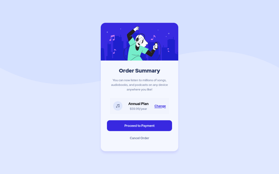
I appreciate any suggestion to improve my code! Feel free to tell me what I could have done better. I struggled to make it responsive and to align the "change" link to the right
Community feedback
- @correlucasPosted over 2 years ago
Ciao Vittorio, congratulation for you solution!
I'm looking your website solution now and everything seems fine. The desktop design and the mobile one is alright. You've matched the challenge and design purposes.
The only thing you could consider add to your solution is a minor fix to the price section. Note that in a resolution under 300px the elements start to pop out the container. You can fix it applying flex-direction to this section with a media query. Note the code below:
@media (max-width: 300px) .plan { display: flex; justify-content: space-between; flex-direction: column; }I hope it helps you. Happy coding.
Marked as helpful0@VittorioDLPosted over 2 years ago@correlucas I knew it was an issue but I had no idea how to solve it. Thank you so much!
1

Please log in to post a comment
Log in with GitHub
Join our Discord community
Join thousands of Frontend Mentor community members taking the challenges, sharing resources, helping each other, and chatting about all things front-end!
Join our Discord