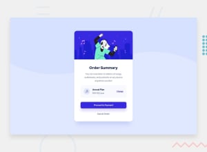
Design comparison
Solution retrospective
🫡 Hello, Frontend Mentor Army. This is my solution for the Order Summary Card
Another great Challenge by Front-End Mentor #LearningByDoing
I'll be happy to hear any useful feedback and advice! 🙌
Community feedback
- @SinisaVukmirovicPosted almost 2 years ago
Hello!
Looks good to me!
Hovever, I would change this...
* {
    margin: 0 auto;
    padding: 0;
    font-size: 16px;
}
...with...
* {
    margin: 0;
    padding: 0;
    box-sizing: border-box;
}
...and keep the font-size in the html or body styles.
Its working fine on a small project like this, but could make you problems on larger projects in the future.
Also, I like the animation of the corners for button on hover. But I wouldn't keep both background color change, too. Maybe, its just a preference, or guidlines of "Less is more". Since the corner animation is fairly noticeable, I don't think background color change is needed too, in that case.
Keep on building!
1@deveshshuklaPosted almost 2 years ago@SinisaVukmirovic, hey buddy thanks for the above suggestion, It will really help me to write clean code... For that button thing, I also agree... Less animation is a good one. Actually, in the design file, the active state shows the color change that's why I added... But I appreciate your comment. 🙂👍 Thanx.
0
Please log in to post a comment
Log in with GitHubJoin our Discord community
Join thousands of Frontend Mentor community members taking the challenges, sharing resources, helping each other, and chatting about all things front-end!
Join our Discord
