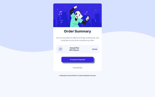
Order Summary Component

Solution retrospective
I started this challenge a while ago but didn't finish it because I got busy with other things. I am proud that I was able to come back to it and complete it faster than I have with previous challenges. I feel like it's easier for me to jump back into my code and figure out what's going on than it was when I first started.
What challenges did you encounter, and how did you overcome them?I think my biggest challenge when I started this project was getting all of the elements lined up correctly within the card.
What specific areas of your project would you like help with?I don't have any specific areas where I am looking for feedback. Happy for any general comments on how I can improve my code to more closely match the original design concept!
Please log in to post a comment
Log in with GitHubCommunity feedback
No feedback yet. Be the first to give feedback on Stephanie Dennehy's solution.
Join our Discord community
Join thousands of Frontend Mentor community members taking the challenges, sharing resources, helping each other, and chatting about all things front-end!
Join our Discord