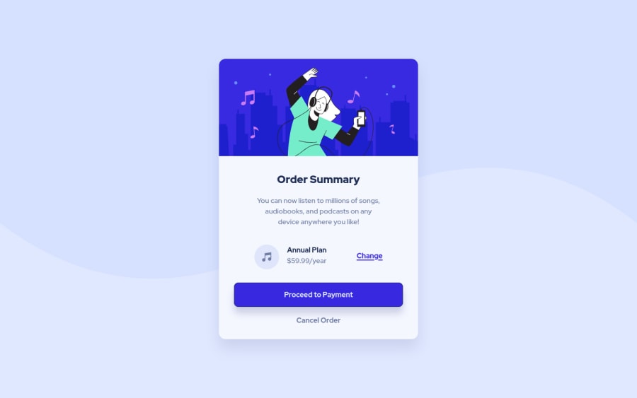
Design comparison
Solution retrospective
Hey there!! 😎👍🏻
I feel that my HTML
is very messy, it there something I could improve in it? Or am I tripping?
Besides, if there's something else in my code you think could be improved, please tell me. All feedback is welcomed!
Have a nice day!
Community feedback
- @EileenpkPosted almost 2 years ago
Hi Pedro, your project looks great. I think your
HTML
is very clean and you are using semantic tags which is very good. I also liked how you left comments in your CSS, which made it very easy to read, and quickly find things. If I had to pick something for you to change it would be the use of classes instead of Ids. Generally, Ids are used to target things in JavaScript, and classes are used to style in CSS. One of the cool things about using classes is that you can use them to shorten your stylesheet and make it drier. I saw that you had a few sections that used display flex. If you make a class in the stylesheet called flex, you can then add the flex class to all theHTML
elements that need it.CSS
flex { display: flex; align-items: center; justify-content: center; } main { flex-flow: column nowrap; justify-content: flex-start; }
HTML
<body class='flex'> <main class='flex'> </main> </body>
Hope you found this helpful!
- Let's connect on LinkedIn! - @Eileenpk
Marked as helpful2@Pedro-CelestePosted almost 2 years ago@Eileenpk It seems the book I used to learn CSS taught me the wrong way of using
ids
haha. Thanks for letting me know!0 - @VCaramesPosted almost 2 years ago
Hey there! 👋 Here are some suggestions to help improve your code:
- It is best practice ✅ to use,
classes
for styling purposes, while usingids
solely for JavaScript.
- The "illustration" and “music icons” in this component are purely decorative. ⚠️ Their
alt tag
should be left blank to hide them from assistive technology.
More Info:📚
https://www.w3.org/WAI/tutorials/images/
- The
section
element is being used incorrectly ⚠️ and not needed for this challenge .
- For improved accessibility 📈 for your content, it is best practice ✅ to use
em
formedia-queries
. Using this unit gives users the ability to scale elements up and down, relative to a set value.
If you have any questions or need further clarification, feel free to reach out to me.
Happy Coding! 🎆🎊🪅
Marked as helpful1@Pedro-CelestePosted almost 2 years ago@vcarames This thing about decorative images makes tons of sense, thanks for sending me this article, it was really helpful!
0 - It is best practice ✅ to use,
- @superpooperxxxPosted almost 2 years ago
Hi, Pedro, good job on this task.
I don't think your HTML is messy, but you can improve readability of it.
- If you have 3+ attributes in tag format it like this⬇️
<img id="illustration" src="assets/images/illustration-hero.svg" alt="Illustration of a happy person dancing with earbuds" >
- If you have inner tags, don't put them all in one line
<p id="annual-plan"> <strong>Annual Plan</strong> <br> $59.99/year </p>
- Also never use tag name or id for stylings. Always use classes!
1
Please log in to post a comment
Log in with GitHubJoin our Discord community
Join thousands of Frontend Mentor community members taking the challenges, sharing resources, helping each other, and chatting about all things front-end!
Join our Discord