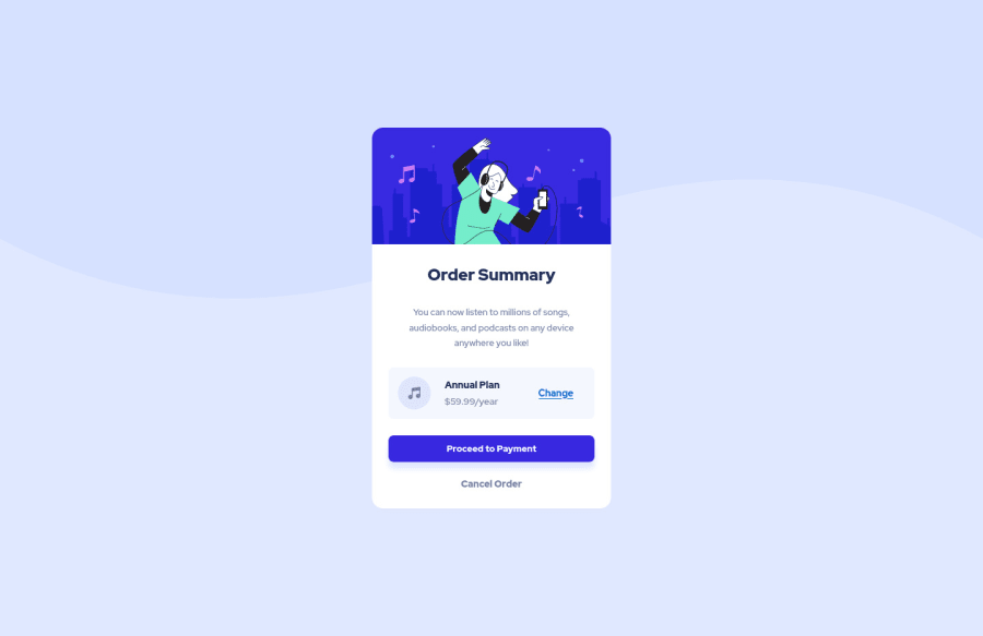
Design comparison
Solution retrospective
Hello, this is my third time doing frontendmentor challenge, a few obstacles that I run into while doing this project are: How do I change the background image from mobile to desktop -> I know that I can use picture element and set a source image and it's media attribute to change the image but for background image, I'm kinda confused. The other thing I want to ask is how do I remove the scrollbar but keep all the body elements in the middle. Overall I think my code is fine but if there is anything that you want to suggest to me feel free to comment, thanks!.
Community feedback
- @MelvinAguilarPosted almost 2 years ago
Hello there ๐. Good job on completing the challenge !
I have some feedback for you if you want to improve your code.
- How do I change the background image from mobile to desktop - r/ using a media query.
@media screen and (max-width: 36em) { body { background-image: url("images/pattern-background-desktop.svg"); } }
- how do I remove the scrollbar but keep all the body elements in the middle - r/ Use
padding: 1rem;
instead ofmargin: 1rem;
on the body to remove the scrollbar
-
Not all images should have alt text. The illustration-hero and music-icon are for decoration purposes only. In this case, you can add aria-hidden="true" to the element and leave the alt attribute blank.
Adding aria-hidden="true" to an image will prevent it from being read by screen readers. This is useful when the image is purely decorative and does not convey any information that needs to be communicated to the user.
<img src="./images/illustration-hero.svg" alt aria-hidden="true" class="card__image">
You can read more about this here ๐
- There is a debate about what is the best type of elements for this challenge, but in my opinion, the "change" element should be a button and not an anchor tag, because anchor tags are typically used to link to other pages or sections of a page, while buttons are used to trigger an action. In this case, the action is to change the plan of the order, so a button would be more appropriate.
I hope you find it useful! ๐
Happy coding!
Marked as helpful0
Please log in to post a comment
Log in with GitHubJoin our Discord community
Join thousands of Frontend Mentor community members taking the challenges, sharing resources, helping each other, and chatting about all things front-end!
Join our Discord