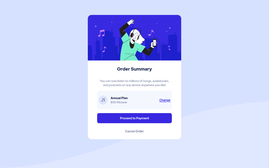
Design comparison
SolutionDesign
Solution retrospective
Hello, why did I have mobile and desktop version for background image and what was I supposed to do with them ?
Community feedback
- Account deleted
You are provided two of those because on desktop you are supposed to use the one labelled desktop, and on mobile use the mobile one, but it's no big deal if you only use one of them.
- I do not think you must have gave the card a height of 90% because when the screen height becomes small it literally shrinks, try a fixed value, or better yet let the content decide how tall it should be by not giving it any height.
- You should also fix the positioning of the background image.
0@SbZhechevPosted about 3 years ago@thulanigamtee i wanted to leave the height to auto but for some reason my card was expanding more and I had a lot of empty space below the buttons. As for the background images aren`t they the same and how do you usually handle background images ?
0
Please log in to post a comment
Log in with GitHubJoin our Discord community
Join thousands of Frontend Mentor community members taking the challenges, sharing resources, helping each other, and chatting about all things front-end!
Join our Discord
