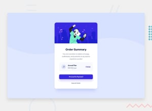
Design comparison
Solution retrospective
I would love to receive feedbacks or suggestions.❤️
Community feedback
- Account deleted
Hi Adan, your component look super nice 🤩 I'm not a pro, but I have two suggestions for you :
-
Instead of < article class="main-container"> you can just use <main>. It will also correct your accessibility issue.
-
Keep the alt text on your images, but let them empty as they are just decorative. Alt text is here to be helpful with accessibility and give a nice image's description. For example : <img src="./images/pattern-background-desktop.svg" alt="bg" />, here "bg" don't give any useful information, you can let the alt empty then.
Hope it can help you. Have a nice day ☺️
Marked as helpful2@AdanSaavedraPosted over 2 years ago@CarolineLienard Thanks for these suggestion Caroline, they are so helpful for me👍🏾😊
0 -
- @vanzasetiaPosted over 2 years ago
Hello there, Adan! 👋
I recommend making the
pattern-backgroundas a background image of thebodyelement instead of an actualimgelement.In addition to @CarolineLienard feedback about the alternative text for an image, it should not be hyphenated (like code) and it should not contain any words that are related to image (e.g. picture, photo, logo, icon, graphic, avatar, etc). It's already an image element. 🙂
<h1 class="plan-item">Annual Plan</h1>should be ah2instead.change-itemandcancel-itemshould be interactive elements instead of paragraph elements. It has interactivity so it should be an interactive element.Always specify the
typeof thebutton. In this case, set the type of them astype="button". It's going to prevent the button from behaving unexpectedly.By default, the font size is
16pxso you don't need to specify it.To make the card perfectly in the middle of the page, you can make the
bodyelement as a flexbox container and then remove any absolute positioning. Currently, on mobile view, the page has a horizontal scrollbar.Hope this helps.
Marked as helpful1@AdanSaavedraPosted over 2 years ago@vanzasetia thanks for your feedback Vanza, it have a lot of information and improvements that I need to do. When you said "it should be an interactive element" i understand it like it should be a button, right? Im really thankful with your comment, because you have remember me basic things that I have forget like put the type of the button, or the default font size is already 16px, thanks for all of that, I will be pay more attention to those details.👍🏾😁
0@vanzasetiaPosted over 2 years ago@AdanSaavedra You're welcome! For the interactive element, it depends on what you think is going to happen after a user clicks it. Is it going to toggle a modal or navigate to another page?
0
Please log in to post a comment
Log in with GitHubJoin our Discord community
Join thousands of Frontend Mentor community members taking the challenges, sharing resources, helping each other, and chatting about all things front-end!
Join our Discord
