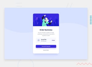
Design comparison
Community feedback
- @grace-snowPosted almost 2 years ago
Really nice solution, well done!
I was going to ask about why change is an anchor tag but proceed and cancel are both buttons. That could be fine but possibly not. The key question is what would you expect to happen on click of each of these?
The only other point to raise is that adding really obvious and clear focus-visible styles to interactive elements is probably more important than active states, as it tells keyboard users where they are focused on the page. These styles should not be subtle and there is a new requirement coming in WCAG 2.2 that focus visible styles must include some kind of thick outline or border on all sides of the element. If there’s ever an enhancement you want to add to things like links and buttons - this is the important one
0@albina0104Posted almost 2 years ago@grace-snow Hello! Thank you for your response!
I have a question about focus-visible styles. I see that browsers already do this thing for us - they add an outline on each focusable element when I press Tab. Is it not enough, do I need to do something else?
0@grace-snowPosted almost 2 years ago@albina0104 it depends how obvious they are on each specific design. Often the defaults are too subtle or hard to see
0 - @MelvinAguilarPosted almost 2 years ago
Hello there 👋. Good job on completing the challenge !
I have some feedback for you if you want to improve your code.
-
You can add aria-hidden="true" to illustration-hero the element .
Adding aria-hidden="true" to an image will prevent it from being read by screen readers. This is useful when the image is purely decorative and does not convey any information that needs to be communicated to the user.
<img src="./images/illustration-hero.svg" alt aria-hidden="true">You can read more about this here 📘
- There is a debate about what is the best type of elements for this challenge, but in my opinion, the "change" element should be a button and not an anchor tag, because anchor tags are typically used to link to other pages or sections of a page, while buttons are used to trigger an action. In this case, the action is to change the plan of the order, so a button would be more appropriate.
I hope you find it useful! 😄
Happy coding!
0@albina0104Posted almost 2 years ago@MelvinAguilar hello!
- About
aria-hidden=true:- Grace in Frontend Mentor Slack community informed me that
aria-hidden=trueis not necessary these days, emptyalttag is enough for decorative images (Link to the Slack thread); - I have checked with a screen reader on my Android phone - it completely ignores the image with an empty
alttag without the aria tag; - I have checked in Firefox DevTools - the image does not appear in the Accessibility tree;
- Also there's nothing about
aria-hidden=truein the article you provided, it says only about the need of an emptyalt=""tag.
- Grace in Frontend Mentor Slack community informed me that
- About the button - I agree with you, I'll change it, thank you! (I chose the anchor tag only because it's underlined and visually looks like a link.)
2@MelvinAguilarPosted almost 2 years ago@albina0104 Hi Thank you very much for the clarification and I apologize sincerely, have a great day!
0 -
Please log in to post a comment
Log in with GitHubJoin our Discord community
Join thousands of Frontend Mentor community members taking the challenges, sharing resources, helping each other, and chatting about all things front-end!
Join our Discord
