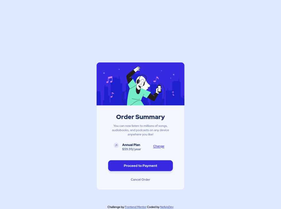
Design comparison
SolutionDesign
Solution retrospective
-
This challenge was pretty straight forward and I had a really fun time making it. It was a bit easier than the NFT component card in my opinion.
-
I think I did a pretty decent job making everything work I'm not sure if there is any part of my code I could have made much better from my current understanding.
-
Is there anything anyone thinks I can do to better improve my code. Or is there anything that would make my code much easier to read and or understand?
Community feedback
Please log in to post a comment
Log in with GitHubJoin our Discord community
Join thousands of Frontend Mentor community members taking the challenges, sharing resources, helping each other, and chatting about all things front-end!
Join our Discord
