Design comparison
Solution retrospective
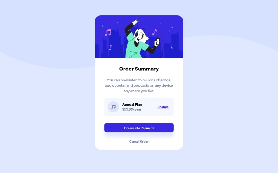
A fun challenge which helps to reinforce the skills acquired from the other card element challenges. The use of flexbox within flexbox was interesting and logical, and I'm pleased to say that generally speaking the final result was achieved without difficulty.
Question(s):
- Is there anything striking as out of place in terms of syntax or approach to the challenge? As I progress through these challenges its important for me to learn the best practices and easiest methods of approach. I will be returning to add/adjust the alt text in the near future.
Community feedback
- @mycrochipPosted over 2 years ago
Hi again, well done in completing this challenge.
I learned a lot from your feedback on my solution, and your solution to this challenge on GitHub. Thank you for bringing my attention to the mobile-first approach.
I saw that your .atr was positioned absolutely. I see this as an effort to keep it positioned at the bottom always, right? It however overlaps the card when I resize my window.
The 'order summary' and 'annual plan' are of the same color, and they should be the dark blue version in the style guide.
These changes are very minimal; I really appreciate your feedback and felt I should help out on yours too. Happy building!
Marked as helpful1@Jorgus1710Posted over 2 years ago@mycrochip Hey thanks for taking a look!!
Your correct about the absolute position for the .atr, I wanted it at the bottom and for some reason I couldnt get it to do so without it. As well I had no idea the .atr was misbehaving as you describe 😅. I never quite thought to resize my window diagonally. Up till now I was only resizing the window horizontally which explains why I didn't see the issues you mention.
Your also correct about the colors, admittedly I was lazy and chose them by 'eye' via the color picker that shows up in CSS / VScode. The reason for this is I found the names of the colors in the style guide to be a nuisance to track 😅. None the less thanks so much for taking a look and bringing these issues to my attention. I will make sure to fix these issues before moving on to the next project.
✌️
1
Please log in to post a comment
Log in with GitHubJoin our Discord community
Join thousands of Frontend Mentor community members taking the challenges, sharing resources, helping each other, and chatting about all things front-end!
Join our Discord
