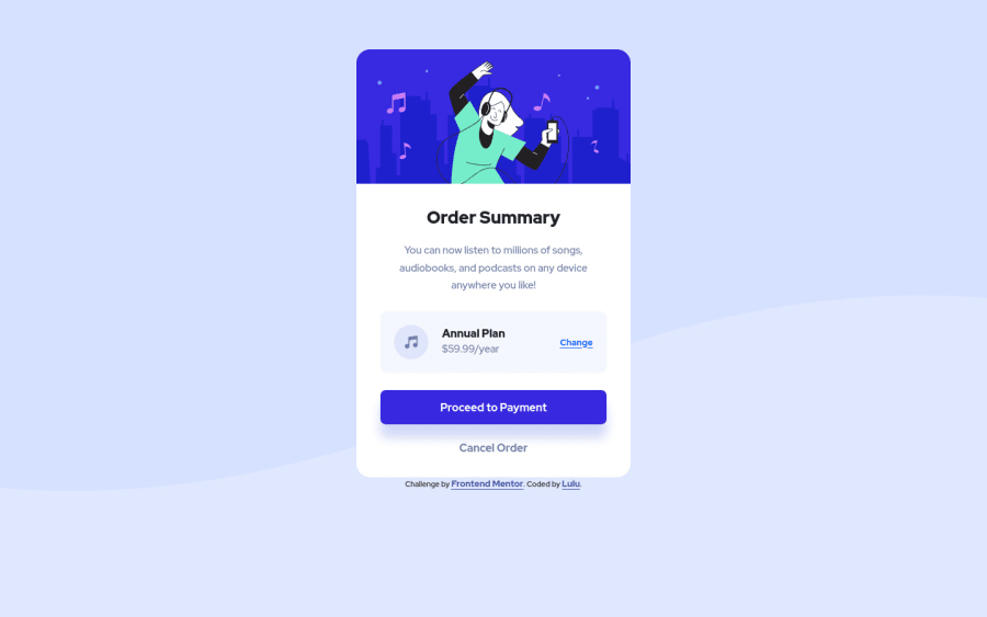
Design comparison
Solution retrospective
Hey guys, I just finished this challenge but i'm having great difficulty adjusting the background image for the desktop view . Please tips on how to do it will be highly appreciated. Thanks.
Community feedback
- @DavidMorgadePosted about 2 years ago
Hello Oluchi, congrats on finishing the challenge! great job in my opinion
You should try for desktop size using
brackground-size: containand remove thebackground-positionit will get your BG image on the middle for 1400px+.Also would like to recommend you using flex to center the component instead of just margins on your
<div>you can get it easily with this on your body (remember to remove the margins):body { display: flex; flex-direction: column; justify-content: center; align-items: center; min-height: 100vh; }With
min-height: 100vhyour body will wrap the whole screen, and then flex-box will center the children wich in this case is the whole card.Hope my feedback helps you, if you have any questions don't hesitate to ask, great job
0
Please log in to post a comment
Log in with GitHubJoin our Discord community
Join thousands of Frontend Mentor community members taking the challenges, sharing resources, helping each other, and chatting about all things front-end!
Join our Discord
