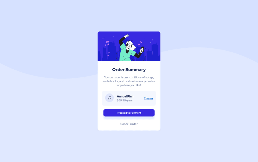


Design comparison

Community feedback
- @tikeyikePosted about 3 years ago
Just some stylistic feedback:
-
You seem to have increased the padding on the smaller screen size - which is kind of the opposite thing to do. Small screens don't have a lot of space, so add more padding is just taking up space that can be used to display the actual content. I would just fix it so on small screen = less padding, bigger screen = you can use more padding, since there is more space e.g. 1.5 rem padding on small screens, 3 rem padding on big screens etc.
-
Your background isn't displaying nicely on bigger screens as well. Try looking at how background-size cover and contain work. Also, if you don't know how the shorthand version of the property works i.e. background, just use the other properties i.e. background-size, background-color, background-image etc. There is nothing wrong is writing it out the long way if that means your CSS works 😁
Marked as helpful0@Vintage1000Posted about 3 years ago@tikeyike Thanks for the feedback , Regarding the padding for smaller screens I was trying to match the design for mobile version. I am still learning about CSS and will try to improve.
0 -

Please log in to post a comment
Log in with GitHubJoin our Discord community
Join thousands of Frontend Mentor community members taking the challenges, sharing resources, helping each other, and chatting about all things front-end!
Join our Discord