Not Found
Not Found
Not Found
Not Found
Not Found
Not Found
Not Found
Not Found
Not Found
Not Found
Not Found
Not Found
Not Found
Not Found
Not Found
Not Found
Not Found
Not Found
Not Found
Not Found

Submitted

Order summary component

Headbwoiβ€’ 1,100

@xeuxdev

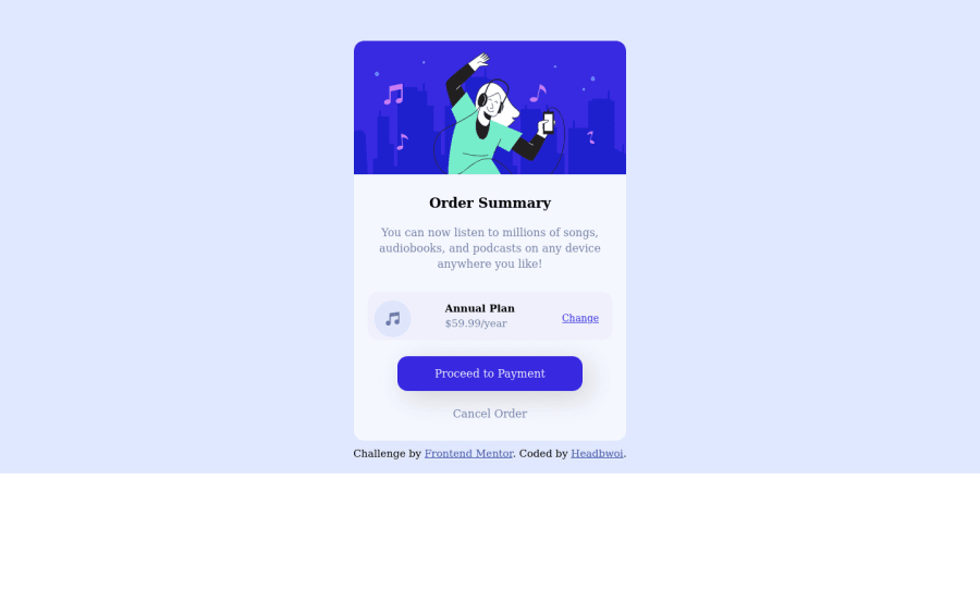
Desktop design screenshot for the Order summary component coding challenge

This is a solution for...

  • HTML
  • CSS
1newbie
View challenge

Design comparison


SolutionDesign

Solution retrospective


I would appreciate any kind of feedback ☺️

Community feedback

Travolgi πŸ•β€’ 31,400

@denielden

Posted

Hi Headbwoi, I took some time to look at your solution and you did a great job!

Also I have some tips for improving your code:

  • remove all margin from main .container .row class because with flex they are superfluous
  • use flexbox to the body for center the card
  • after, add min-height: 100vh to body because Flexbox aligns child items to the size of the parent container
  • try to add a little transition on the element with hover effect
  • For add the top image in the background just put more specific background properties to the body:
background: url("../img/pattern-background-desktop.svg") no-repeat top center;
background-size: contain;
background-color: #e0e8ff;

Overall you did well :)

Hope this help and happy coding!

Marked as helpful

0

Headbwoiβ€’ 1,100

@xeuxdev

Posted

@denielden Thanks so much 😊

1
teamieβ€’ 470

@tea-scripts

Posted

Great job completing the challenge. Some things I'd just like to point out:

  • Always keep your font-size at 100% the user might have reduced the font size of their browser for better visuals but if you're set to 62% they'd only get 62% of whatever they have in their browser settings.
  • Try to be a bit more creative with class naming (although it's not set in stone it's just considered best practice and also beneficial when you're collaborating with other developers).
  • Also don't keep your universal selector too busy you can have the main configuration in there like the margin, padding and box-sizing but other styles can be contained in the body tag because the universal selector has a no specificity in CSS.
  • Try aligning the "change" button in the center and this can be achieved using either the CSS Grid or Flexbox easily without messing around with margin or padding or using float(if you're using float don't forget to add a clearfix because the flow of elements would look messy).
  • You can also align the entire content of the .body container using CSS Grid or Flexbox.
  • Your "proceed to payment" button should have the same width as the "plan". you can style your button as an inline-block or block and then center the text. you need to also add a width to the .tail container.
  • Your fonts could also use some font-weights to make them look nicer and close to the requirement. I hope these help. Happy coding mate πŸ‘!

Marked as helpful

0

Headbwoiβ€’ 1,100

@xeuxdev

Posted

@coder-teamie Thanks so much

0
Abdur Rouf Tarekβ€’ 120

@rouftarek

Posted

Nice work.

Couple of things...

  • add the background image in main .container { }
  • Center the .container, not .row
  • <div class="tail"> <a href="#">Proceed to Payment</a> <p>Cancel Order</p> </div> Here I think Proceed to Payment would be better with a button same for Cancle Order. Atleast it should be a link.

Marked as helpful

0

Headbwoiβ€’ 1,100

@xeuxdev

Posted

@rouftarek thanks man ✌️😊 Definitely correct that later✌️

0

Please log in to post a comment

Log in with GitHub
Discord logo

Join our Discord community

Join thousands of Frontend Mentor community members taking the challenges, sharing resources, helping each other, and chatting about all things front-end!

Join our Discord