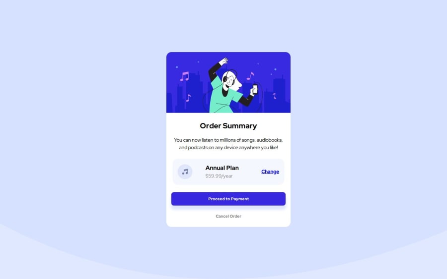


Design comparison

Solution retrospective
I attempted to use what I learned about HTML structure from previous challenges to make this one a bit better. I used the mobile-first technique starting from a screen width of 320px. Before submitting my design, I adjusted the screen resolution and font-size on my computer to check for accessibility and readability across the different screen sizes in devtools.
What challenges did you encounter, and how did you overcome them?I wasn't sure what to do about the background image svg. I'm not familiar with svg, so I just treated it as a regular image and changed the background color alongside it to match the design jpg the best I could.
What specific areas of your project would you like help with?Is there a better, more complete way to check for accessibility on top of what I already talked about doing? To adjust my font-size, I did System Settings > Displays > Larger Text, went with the largest option, and then viewed my design in my normal browser AND through responsive design in devtools. I also looked at the live page on my phone. Everything obviously looked fine on my end, but I worry that I am missing something by not checking a certain setting.
Community feedback
Please log in to post a comment
Log in with GitHub
Join our Discord community
Join thousands of Frontend Mentor community members taking the challenges, sharing resources, helping each other, and chatting about all things front-end!
Join our Discord