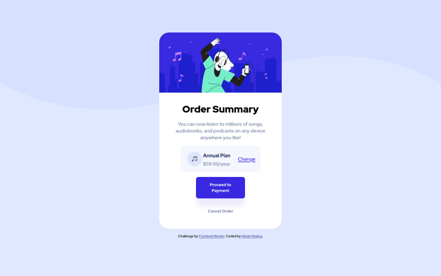
Design comparison
SolutionDesign
Solution retrospective
This one I enjoyed a lot! My biggest challenge was the drop shadow on the primary button. https://box-shadow.dev/ really coming in clutch there. Thank you in advance for your feedback!
Community feedback
- @aiacyPosted over 2 years ago
Not sure why the screenshot looks like that, if any one can give some insight. Looks okay to me in the broswer
0
Please log in to post a comment
Log in with GitHubJoin our Discord community
Join thousands of Frontend Mentor community members taking the challenges, sharing resources, helping each other, and chatting about all things front-end!
Join our Discord
