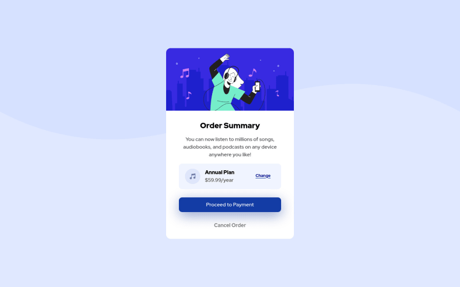
Design comparison
Solution retrospective
Any tips and comments help. Also I feel like I am positioning things wrong. For example in the section for the Annual plan/music icon area I feel like there is a easier way to accomplish positioning everything if someone can check the code out and let me know that would be great.
thanks.
Community feedback
- @Osama-ElshimyPosted over 2 years ago
Nice work!
A few points to improve:
In HTML:
- Every
aelement should have anhrefattribute. If the link doesn't go anywhere, assign it to #href="#"
<div class="cancel-order"> <a href="" class="cancel">Cancel Order</a> </div>-
I also saw that you left an image without an
altattribute.altattributes are essential for screenreaders. Thealtattribute should be descriptive of the image. -
You are using
divelements where you don't have to, this is a bad practice. Only usedivelements when you need to wrap other elements inside one container. -
You didn't need the
divelement with thecard class. You can remove it and add the class to the main element. -
The
divelement with classes ofcontent, order, buttonare not necessary.
In CSS:
-
Never never use
position: absoluteandposition: relativeunless there is no other solution. Flexbox and Grid are much easier and much more powerful. -
You're using
position: absoluteandposition: relativewhere you don't have to. You can instead use flexbox to align and center the elements. -
Flexbox is more than enough in one-dimensional layouts, so you didn't need to use Grid in this challenge. Grid is awesome of course, but it was not necessary.
-
You declared the universal selector
*twice. You can add all the properties once like that:
* { box-sizing: border-box; margin: 0; padding: 0; // It's a good practice to set the `padding` to 0 }- In general, you shouldn't depend on element selectors too much. Use classes and ids instead.
I know that was too much to take in my friend. You did a great job and the learning never stops. If you need any more help, feel free to tell me in the reply.
If you found this helpful, click the 'Mark as helpful' button.
Happy Coding
1 - Every
Please log in to post a comment
Log in with GitHubJoin our Discord community
Join thousands of Frontend Mentor community members taking the challenges, sharing resources, helping each other, and chatting about all things front-end!
Join our Discord
