Not Found
Not Found
Not Found
Not Found
Not Found
Not Found
Not Found
Not Found
Not Found
Not Found
Not Found
Not Found
Not Found
Not Found
Not Found
Not Found
Not Found
Not Found
Not Found
Not Found

Submitted

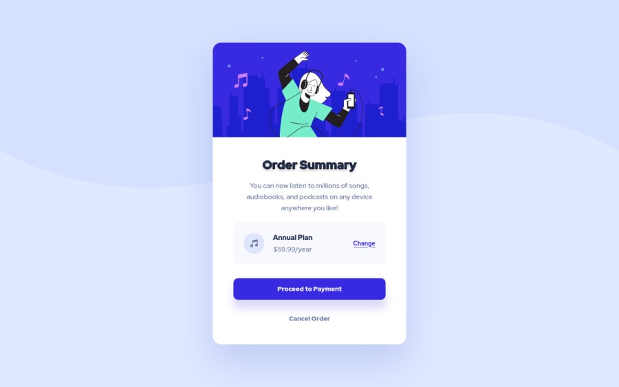
Responsive Order summary / flexbox positioning/ CSS and HTML / FIGMA

@VitorMagnago

Desktop design screenshot for the Order summary component coding challenge

This is a solution for...

  • HTML
  • CSS
1newbie
View challenge

Design comparison


SolutionDesign

Solution retrospective


This challenge is very similar to the last one I did in Front End Mentor, but with a few more challenges, i.e. how to adjust the background image on the screen, the square appearance of the shadow on the card using box shadown, needing to use the filter: drop-shadow() and the title stroke, which I managed to implement only using -webkit-text-stroke.

This time I had the design model available in Figma, and as I had no experience with the tool, it took a little longer than it really looked, but the result was satisfactory, I was able to follow the model almost 100%.

I'm getting used to flexbox positioning, I'm still starting my studies with the CSS Grid, I'll use it in the next challenges.

I need to improve the responsiveness and the media queries I use, but I haven't delved too deeply into the subject yet.

Community feedback

T
Grace 29,310

@grace-snow

Posted

Beyond the font size stuff here's some other feedback

  1. card__info and plan-card should not be section elements. This component is just one card, it's all one piece of related content, not multiple sections on a Web page.
  2. Personally, I'd make annual plan a heading, but that's optional
  3. Not sure why cancel has been wrapped in a span(?) that shouldn't be necessary. Remember spans are for inline layout divs are for block... But this doesn't really need anything, a paragraph would be better as it contains text
  4. More questions for you than feedback - what would you expect to happen on click of each of the interactive elements Change, Proceed and Cancel? It would be good to understand why you've chosen the elements you have
  5. Theres no need to load a reset stylesheet separately. That's an extra server call for no reason, just include the reset in your one stesheet
  6. I recommend linking fonts in the document head instead of importing in css. Again, better for performance
  7. The card should not have a width, only max-width
  8. The card should definitely not have a height. That's really important to learn ASAP. Components containing text content should never have their height limited. Let the browser decide how tall it needs to be based off the content inside and available space (and font size chosen)
  9. Similar with the image. Give it a min height if you like but not a height. I'm surprised the reset you're using hasn't set img tags to display block max width 100% as that's a well established good base style. Maybe explore different modern resets. You may also want to read about the object fit property. It would be very useful here
  10. Card info and plan card must not have a height set either for the reasons outlined above. The only element that should have an explicit height in this challenge is the music icon
  11. Line height must never be in px. Usually this is unitless like 1.5. To calculate line height from px values divide the line height by font size
  12. Next time definitely work mobile first

Marked as helpful

1

@VitorMagnago

Posted

@grace-snow

Hello Grace. Wow, That's a lot of work to do.

Thank you very much for the tips, I will consider each one of them. I will study more and then I will redo these initial challenges.

I started doing these challenges without much knowledge because I was entering in a tutorial hell, and it seems that it was worth, I'm getting a lot of important feedback to direct my studies.

1- Can I use simple divs or is there a more semantic tag to use?

2- I used <p> because I thought the only header on the card was "Order Summary"

3- I can't remember why I used the span tag 😅

4- I believe these elements will take the user to other pages. Did I miss something here?

5- I thought about doing that, but figured it would mess up the file too much.

6- Ok

7- Thank you, I have a lot of doubts about the width and height of the elements, whether or not I should delimit.

8- Ok

9- I'll research more about reset/normalize and definitely fit property.

10- As I said before, I have a lot of questions about the size of elements.

11- I need to start working with relative units. About line height, I only specified that why I had this information in the Figma template. I believe that if I had ignored this property, it wouldn't have made that much of a difference in the final result.

12- I'll work on it.

0
Alamin 2,000

@CodePapa360

Posted

Hi Vitor Magnago👋 Great job on completing this challenge! 🥳

I would like to share a few suggestions on this solution if you don't mind.

  • Use relative units, such as em or rem, instead of pixels for font sizes and element dimensions. This will make your layout more flexible and responsive to different screen sizes.

  • Consider using the box-sizing property to control the size and dimensions of elements. For example, you could use box-sizing: border-box to include the padding and border in the width and height of an element, rather than having them add to the element's size.

  • Use descriptive class names to make your code easier to understand and maintain. For example, instead of using card__image, you could use card-image or card-image-container.

  • Use media queries to apply styles based on the size of the viewport. This will allow you to create a responsive design that adjusts to different screen sizes. You can use the min-width and max-width media features to apply styles based on the width of the viewport. For example, you could use a media query like @media (min-width: 768px) to apply styles when the viewport is at least 768 pixels wide.

Overall, this is a very well done solution to the challenge. Great job!

I hope this feedback was helpful. 😊 Keep up the good work!👍

Marked as helpful

1

@VitorMagnago

Posted

Hello Alamin, thank you very much for the feedback 👋.

  • I really need to start using relative units like rem and em my projects. The figma template I was following had several different font sizes, I preferred to use px to be more faithful to the template, but the next ones I will use relative units.

  • I'm using box-sizing: border-box in a separate "reset" file.

  • I already use @media (max-width: 480px) in the project, do you think I should have used another viewport size?

0
Alamin 2,000

@CodePapa360

Posted

@VitorMagnago The viewport size that you choose to use in your media queries will depend on the design of your site and the types of devices that you want to support.

In general, it's a good idea to use a range of viewport sizes in your media queries to cover a wide range of devices. You might want to start by considering the most common device widths and designing your layout to be responsive at those widths. You can use tools like Google Analytics to get an idea of the most popular device widths among your users.

Here are some common viewport sizes that you may want to consider using in your media queries:

  • 320px: Small smartphones
  • 375px: Larger smartphones, such as iPhone 6 and up
  • 414px: Larger smartphones, such as iPhone 6 Plus and up
  • 768px: Tablets in portrait orientation
  • 1024px: Tablets in landscape orientation and some small laptops
  • 1280px: Laptops and desktop computers with small monitors

Of course, these are just a few examples, and you should adjust your media queries based on the specific needs of your design and your target audience. It's also a good idea to test your design on a variety of devices to make sure it looks good and functions properly at different viewport sizes.

Hope that helps 🙂👍

Marked as helpful

1
T
Grace 29,310

@grace-snow

Posted

@VitorMagnago it's really important to never ever use px for font-size, line-heights or letter-spacing. As soon as you do, your solution is inaccessible

People need to be able to change the base font size in their browser, device or operating system. But they won't be able to if you use px... So use rem instead even on small challenges like this

Marked as helpful

0

@VitorMagnago

Posted

@grace-snow I need to start working with relative units. In the Figma template, the fonts had well-defined values and were more difficult to convert to rem (14px, 17px, 21px). Can I round these values or do I need to be very specific to faithfully follow the template?

I read in some place that relative units are pretty much mandatory for fonts, as you said, but not as good for margin values, padding and more, becouse could break some layouts. What is your personal opinion on the subject?

0

Please log in to post a comment

Log in with GitHub
Discord logo

Join our Discord community

Join thousands of Frontend Mentor community members taking the challenges, sharing resources, helping each other, and chatting about all things front-end!

Join our Discord