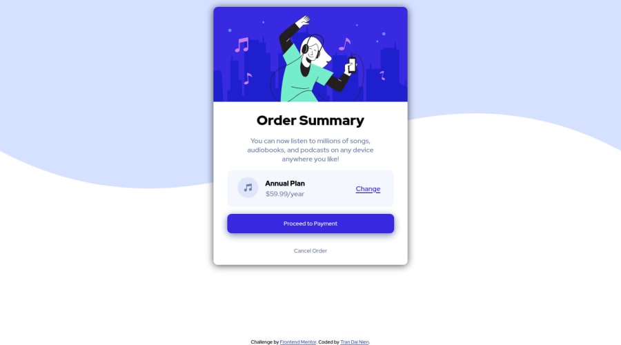
Design comparison
Solution retrospective
Hope to see all your comments
Community feedback
- @SindhujaBandaruPosted about 2 years ago
Hello @trandainien Congrats on complete your new project. A humble mention, you uploaded Order summary component solution to 3 column card component. -->Use a article tag after the body tag to avoid accessibility issues. -->Code for your "option" div to make it active use and also use anchor tag <a href=""></a>(it is used to make/add links)
.option a { margin: auto; margin-left:5rem; font-size: 0.8rem; color: var( --primary-bright-blue); font-weight: 700; }.option a:active { cursor: pointer; color: var(--neutral-desaturated-blue); text-decoration: none; }Happy Coding!Marked as helpful1
Please log in to post a comment
Log in with GitHubJoin our Discord community
Join thousands of Frontend Mentor community members taking the challenges, sharing resources, helping each other, and chatting about all things front-end!
Join our Discord
